Familiarity Sells
Why all the top musical artist websites look the same (and why that's a good thing)
Our Hypothesis
When designing a global e-commerce platform for musical artists, we believe there is little value in reinventing the wheel. E-commerce patterns are well-established. Familiarity isn't lazy design; familiarity converts, and fans expect it.
Leveraging tools like Gemini, 🔥Firecrawl and
Claude, we set out to prove this with data by scaping, visually analyzing and categorizing hundreds of Billboard Top 100 artist storefront pages. Read on in our technical deep dive.
Our Findings
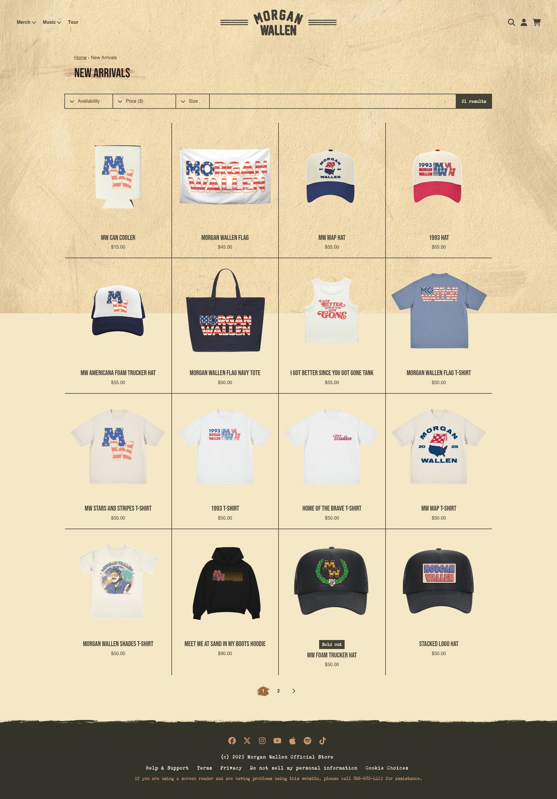
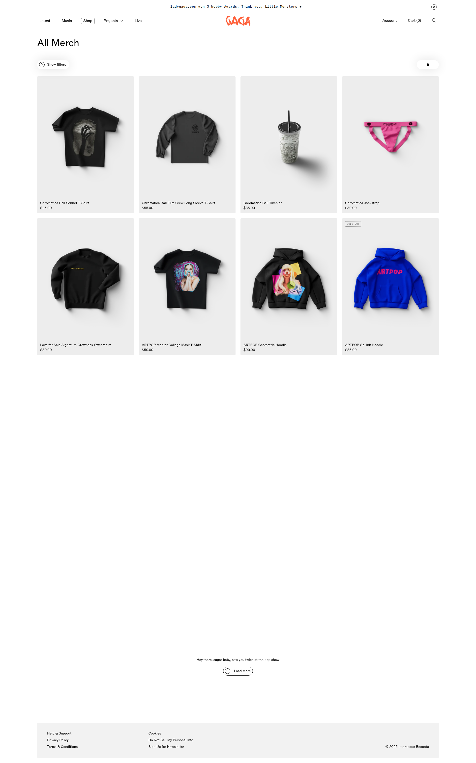
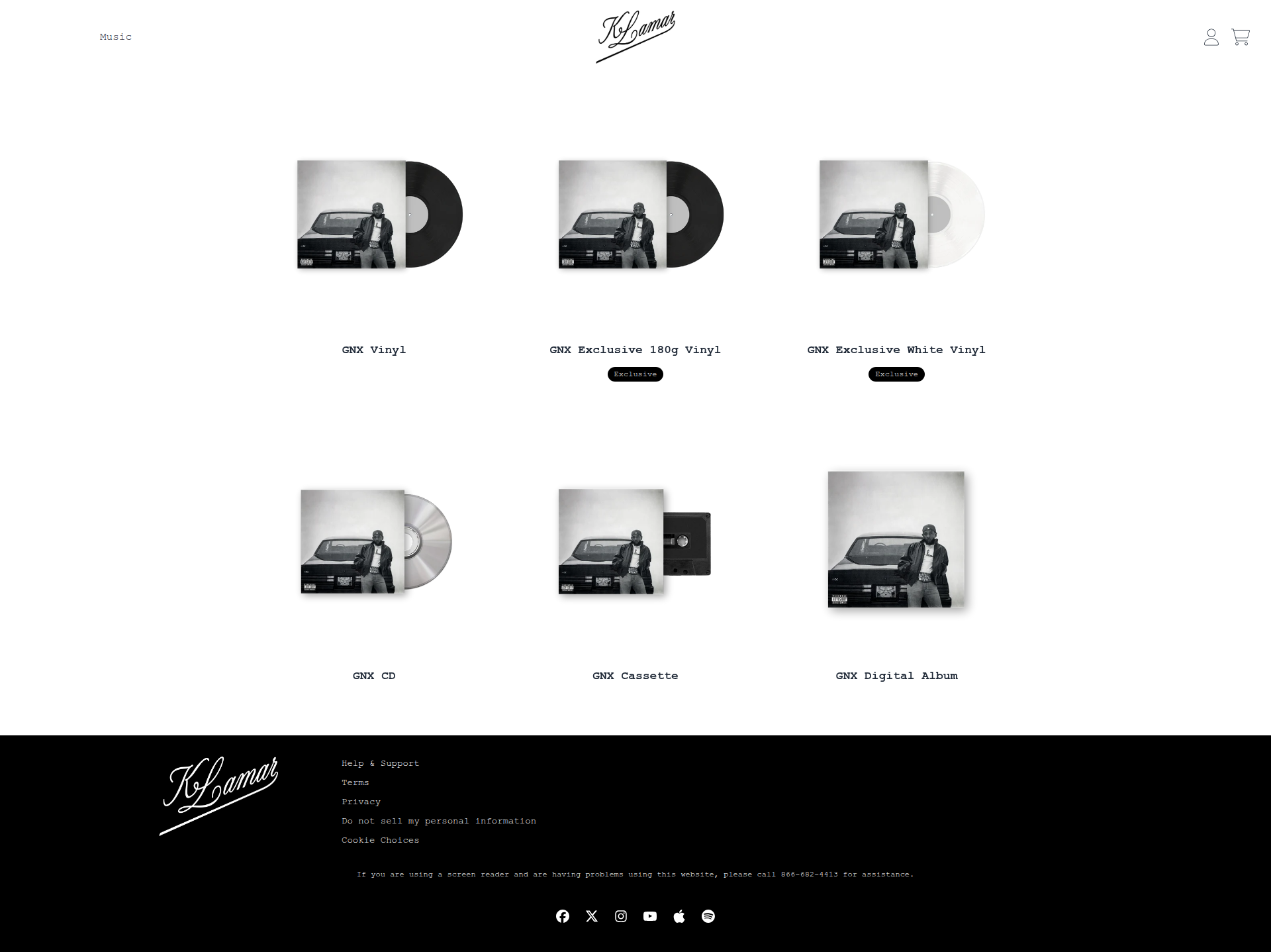
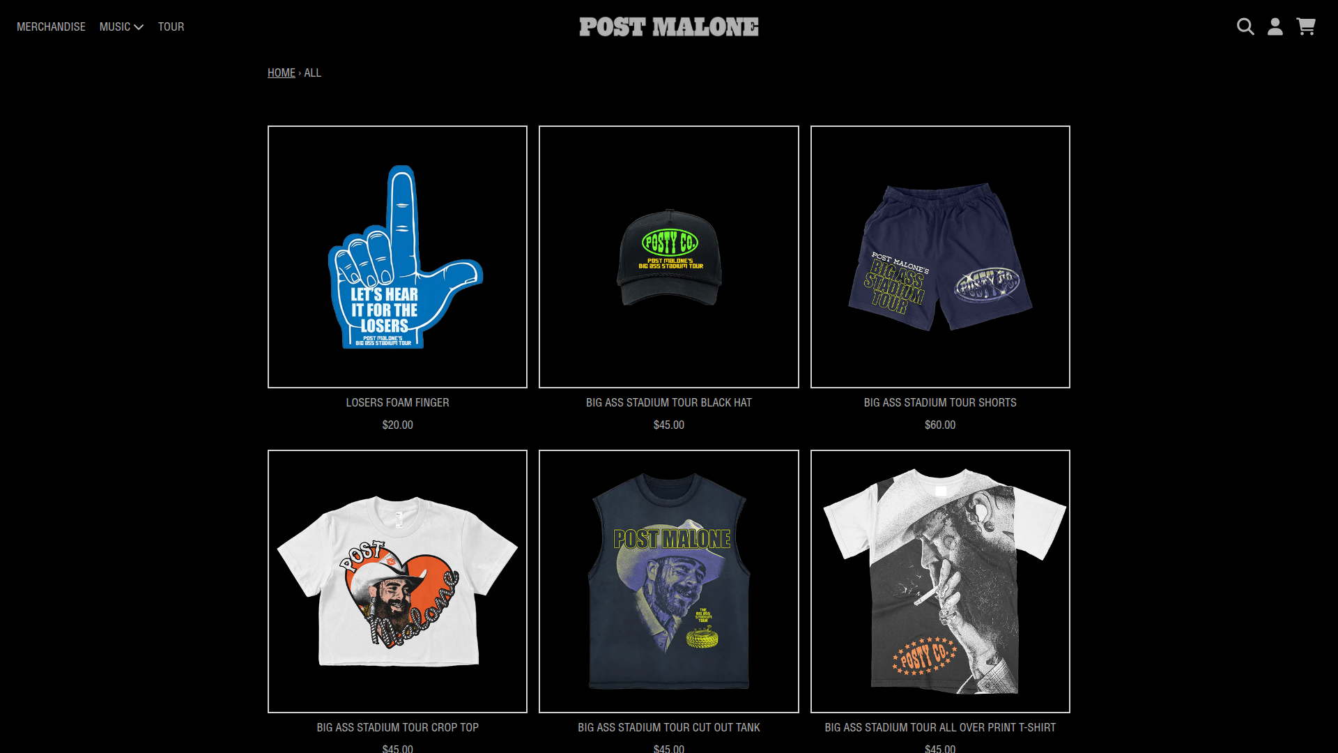
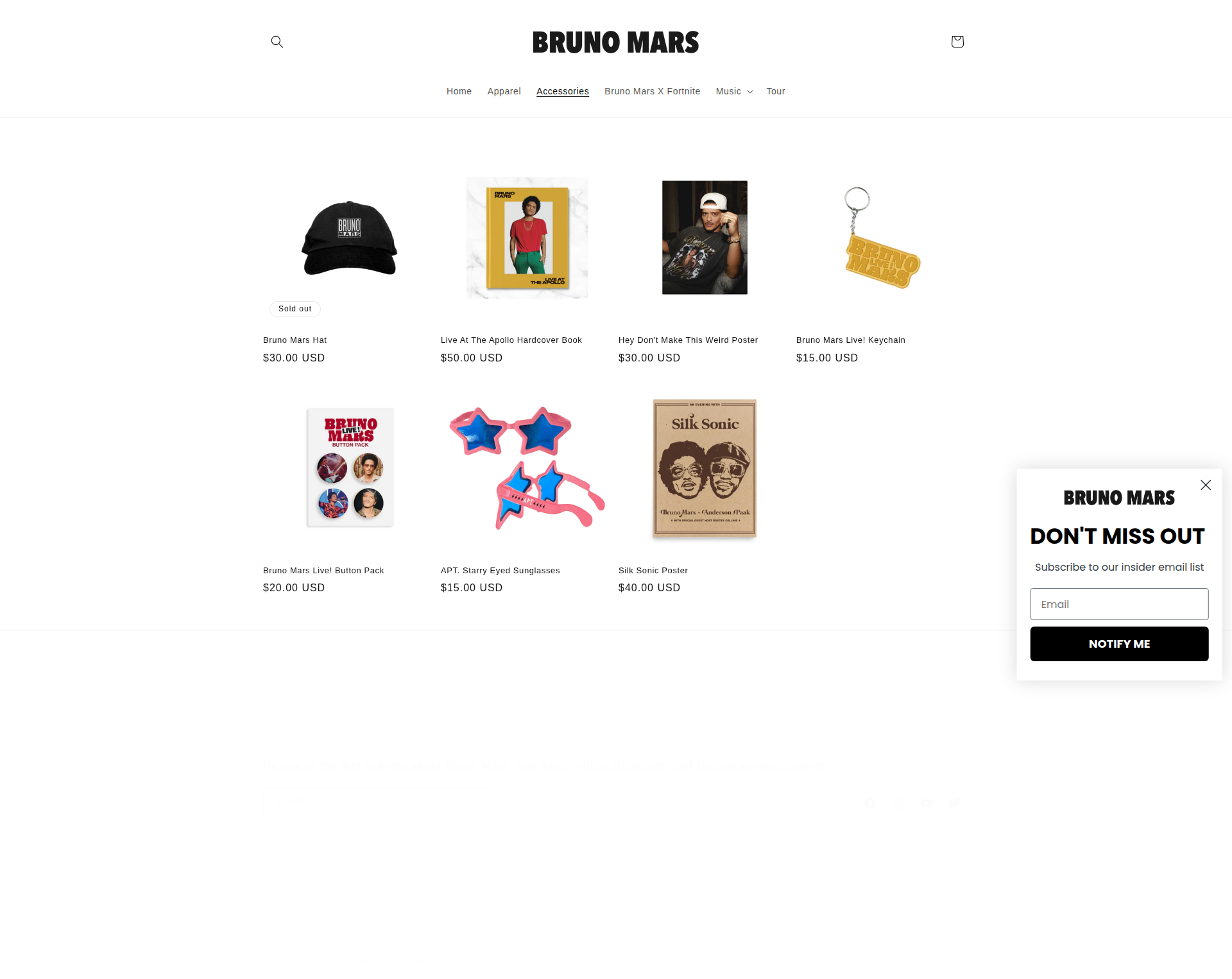
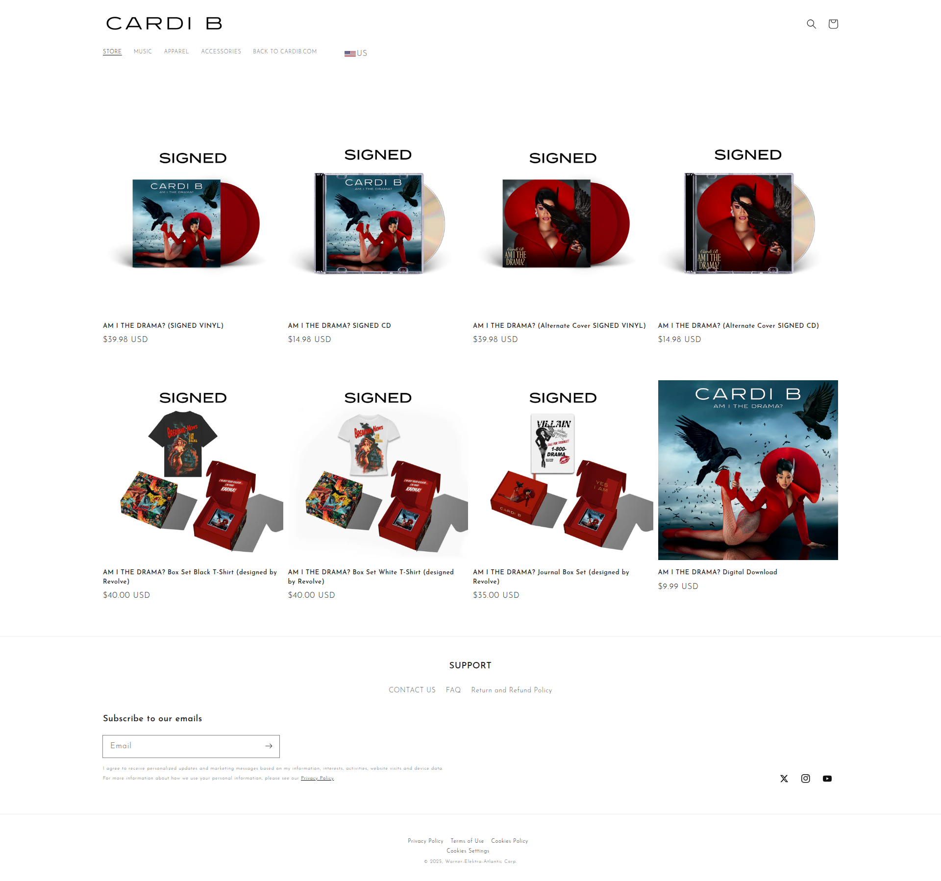
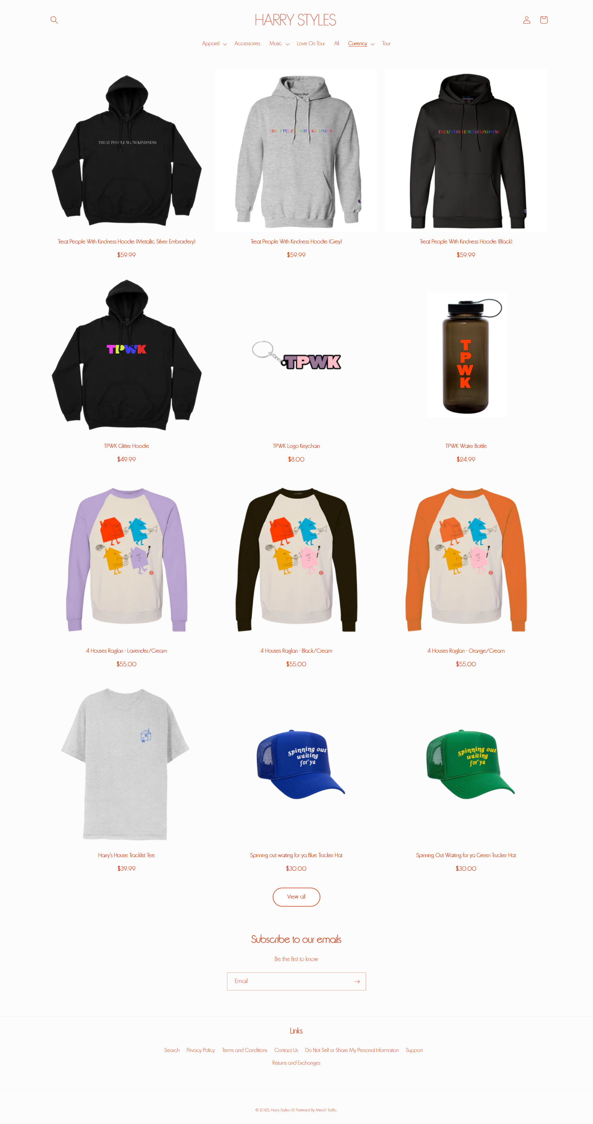
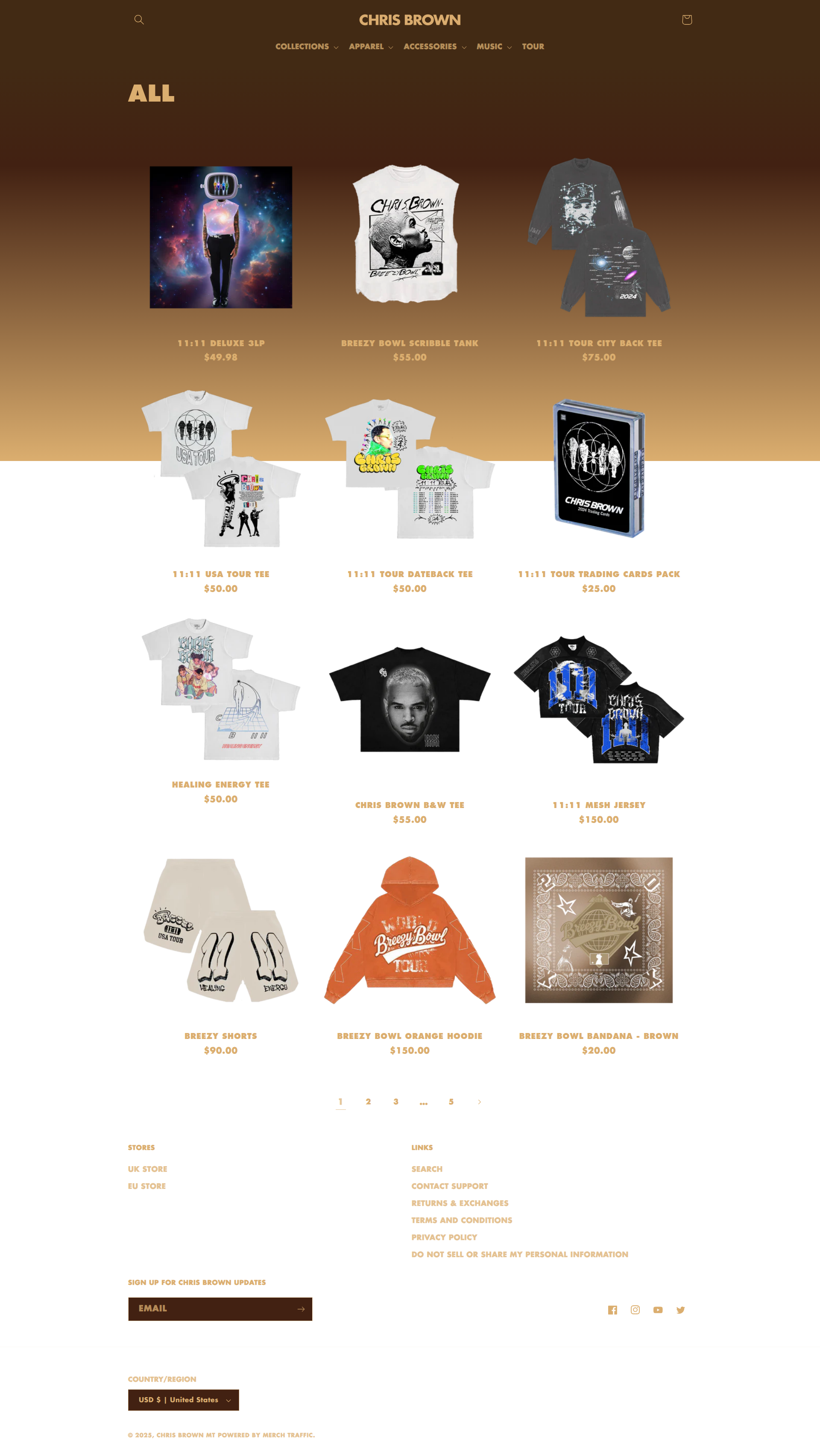
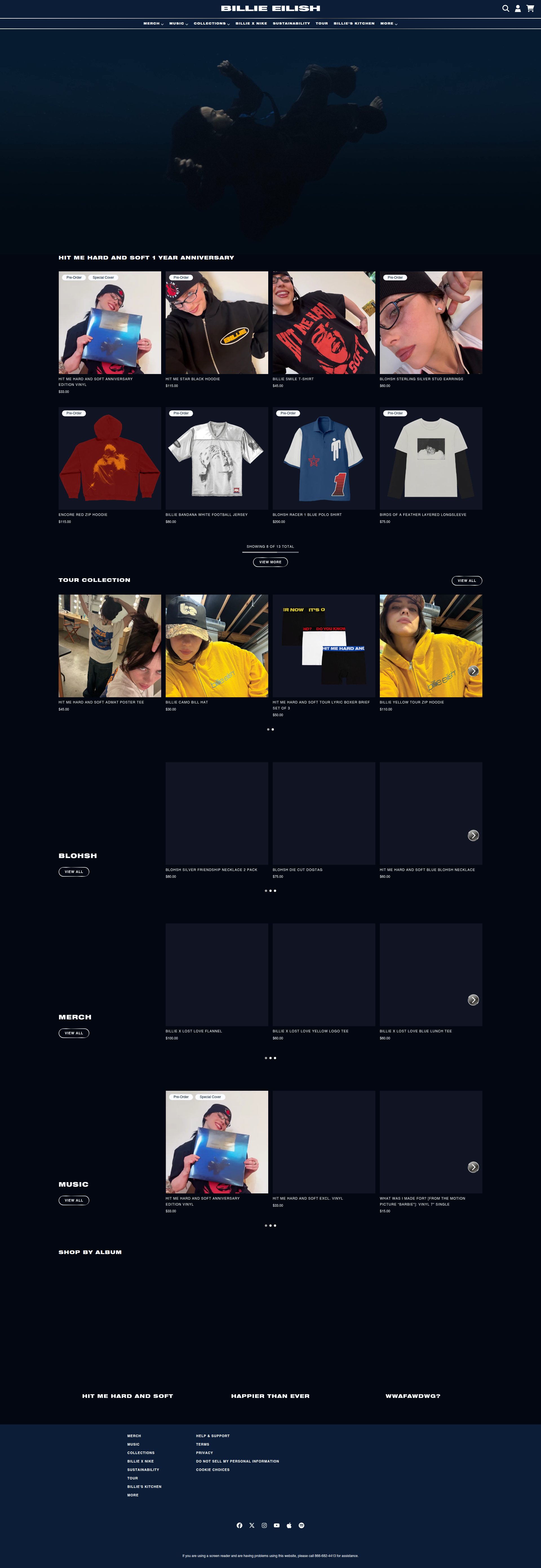
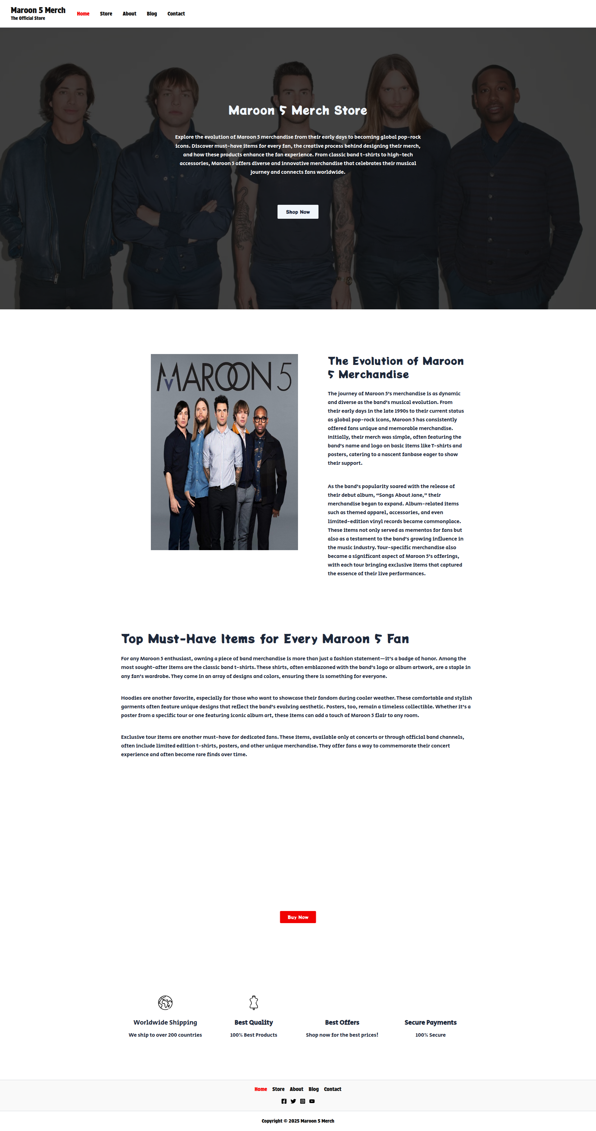
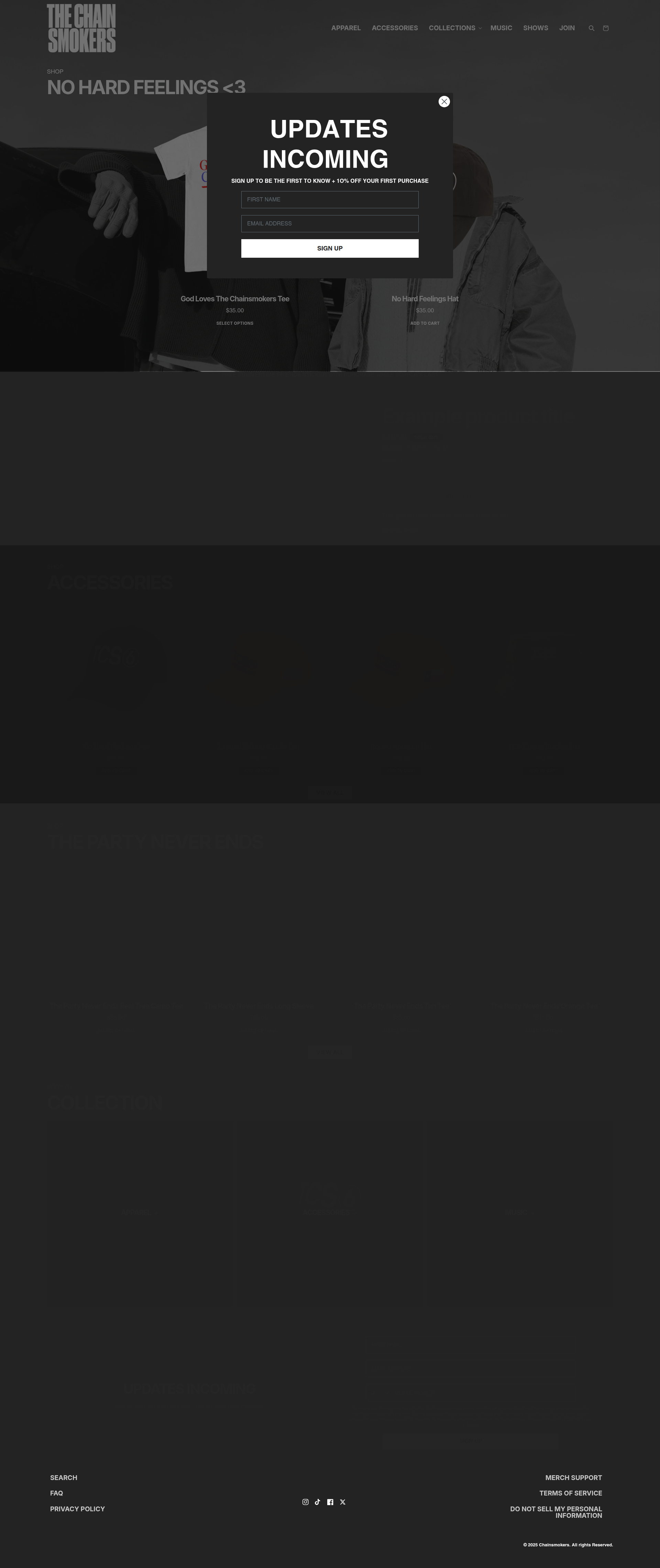
We noticed something striking: there is minimal variance in how musical artist merchandise is presented online. Despite unique branding, global reach, deep budgets and diverse fanbases, the same grid layouts, hero banners, and add-to-cart placements repeat across the board.
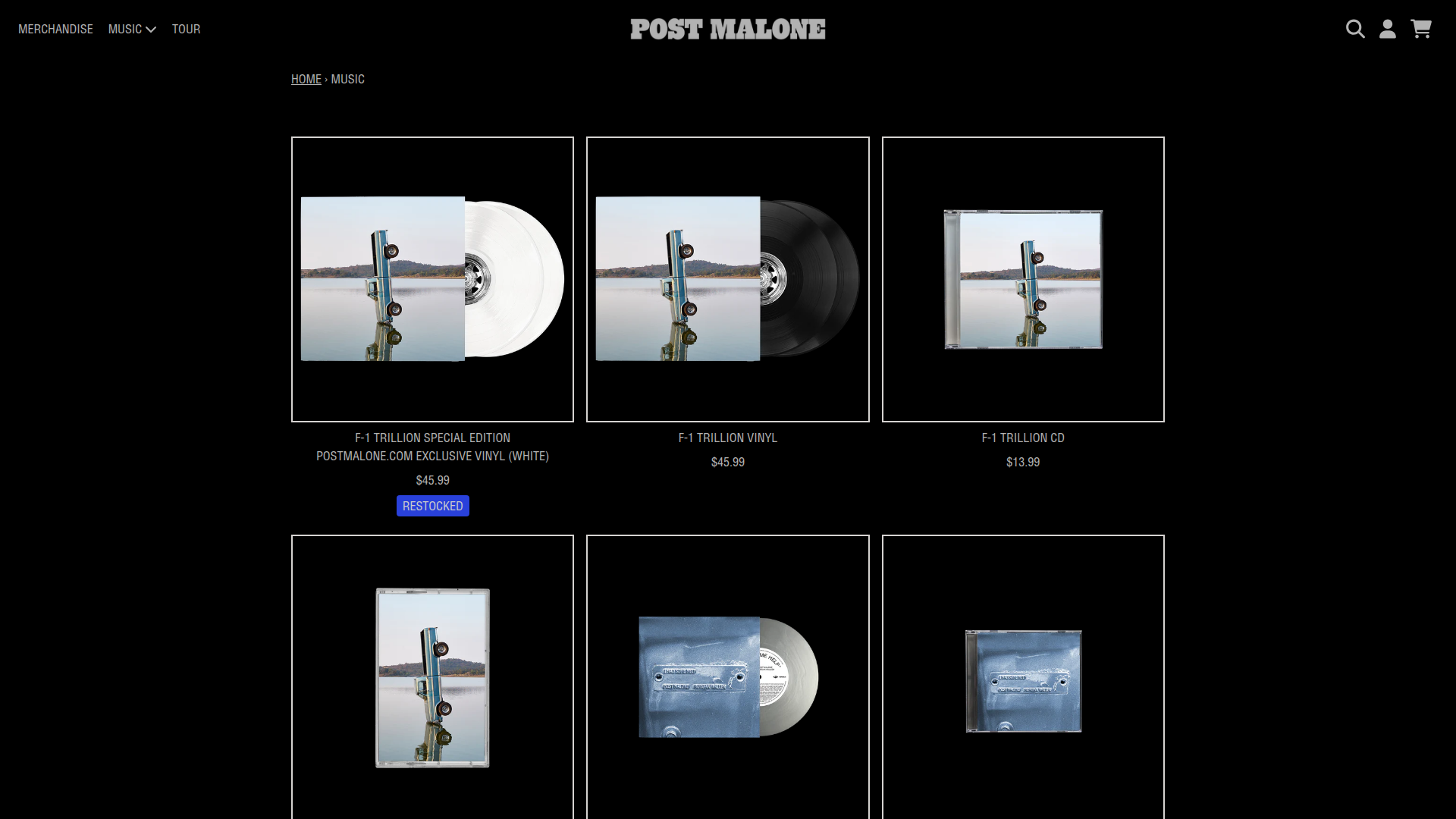
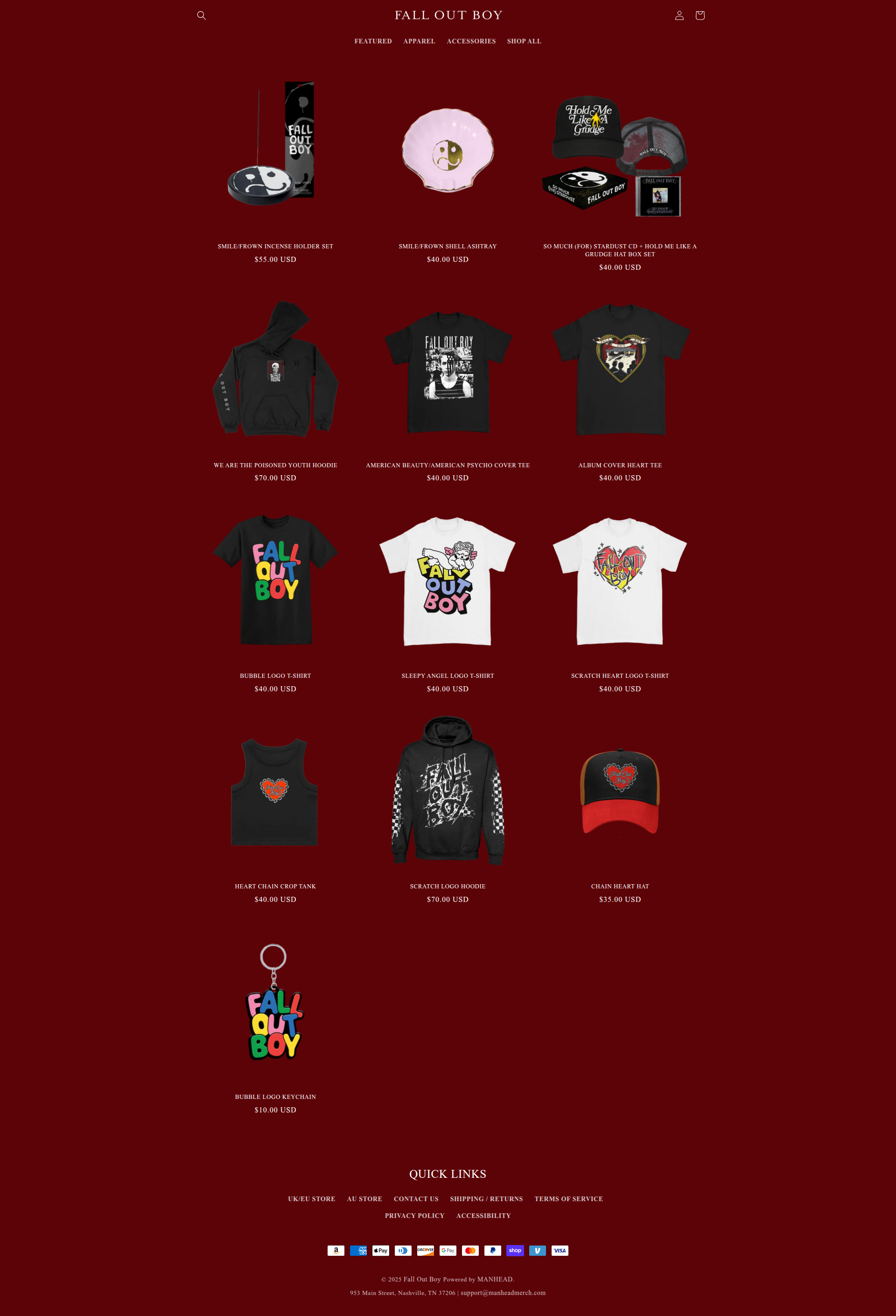
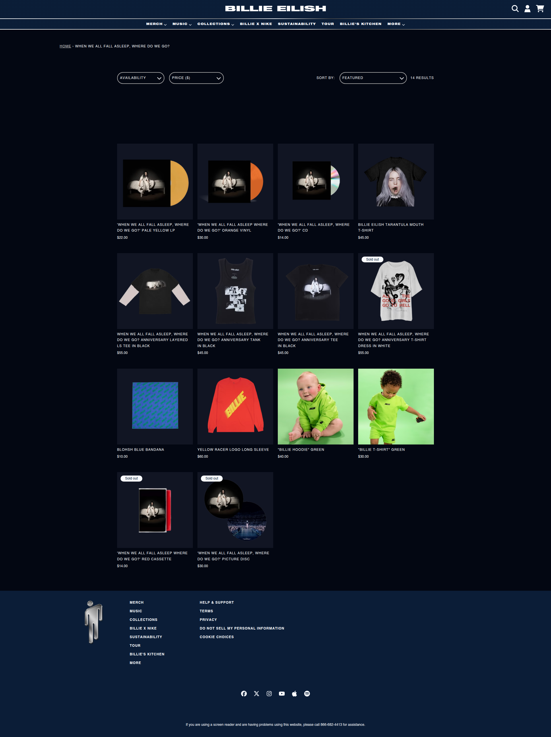
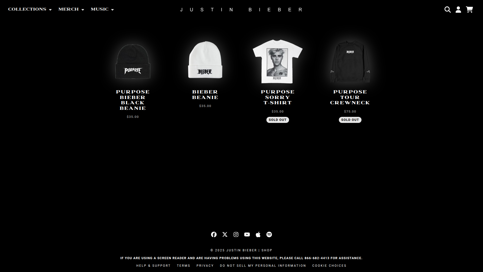
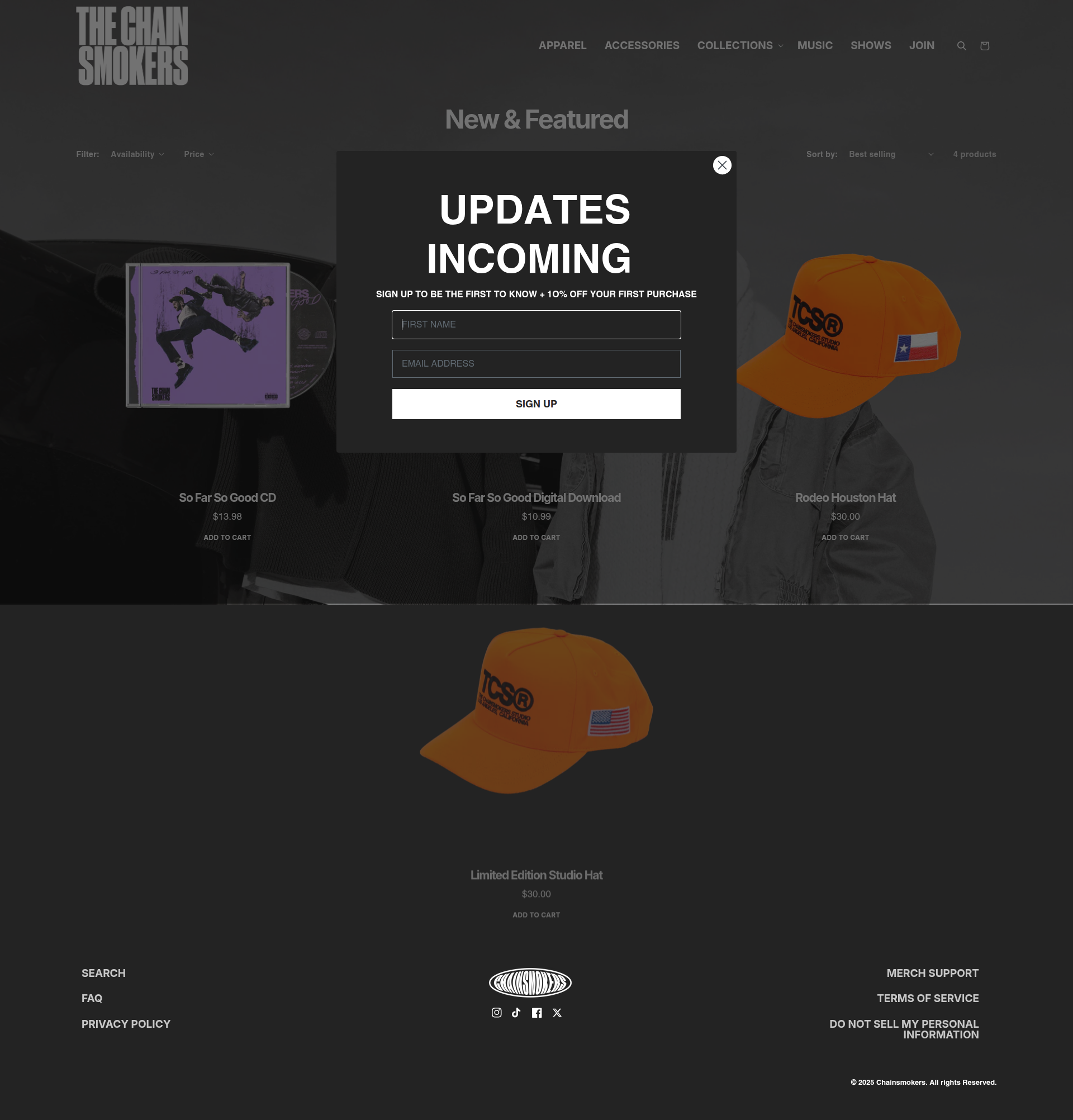
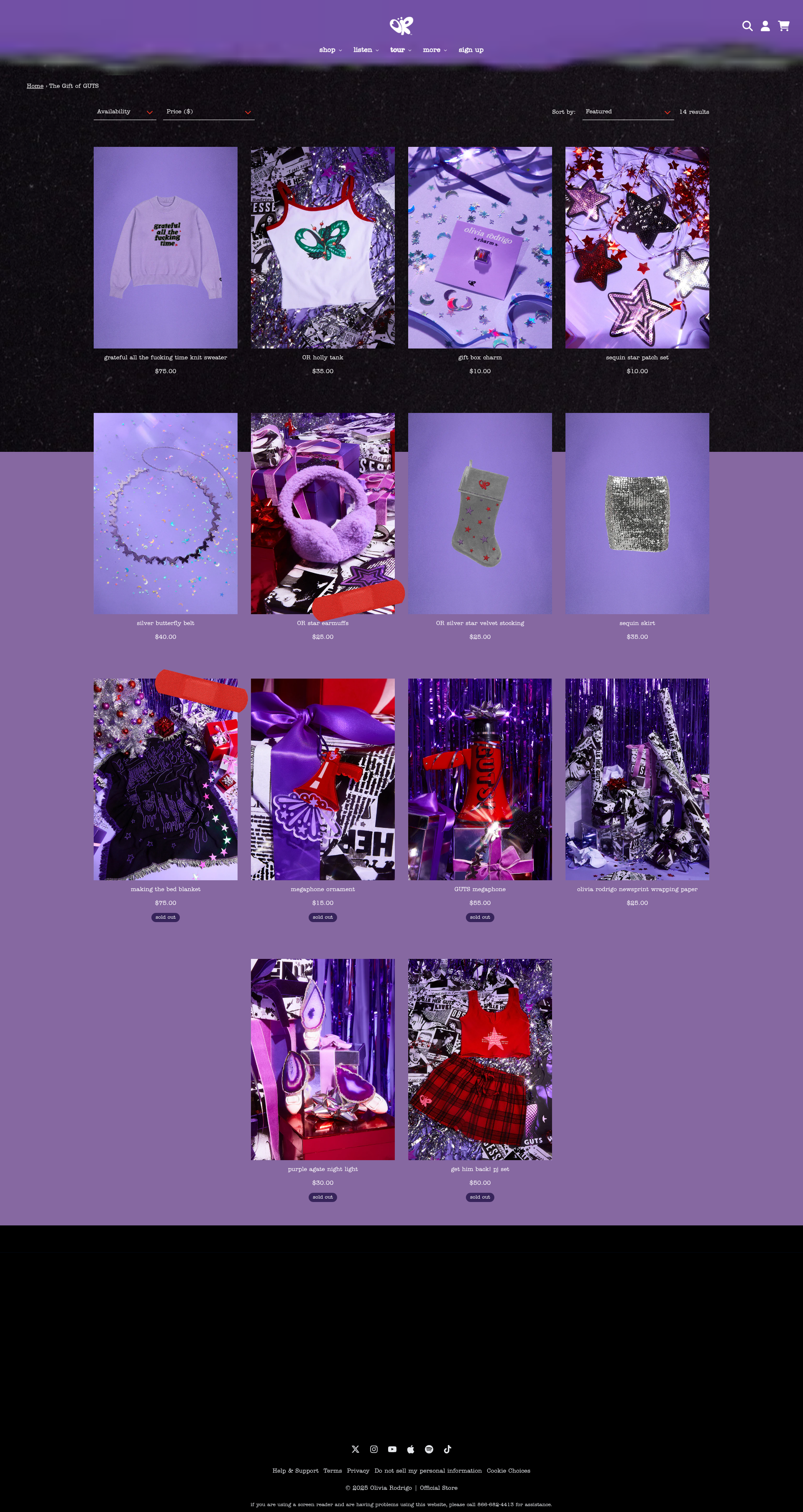
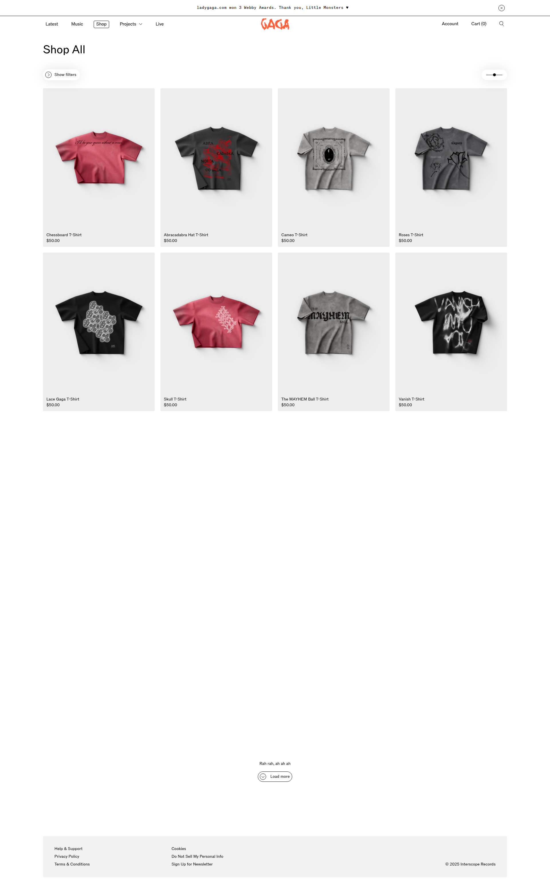
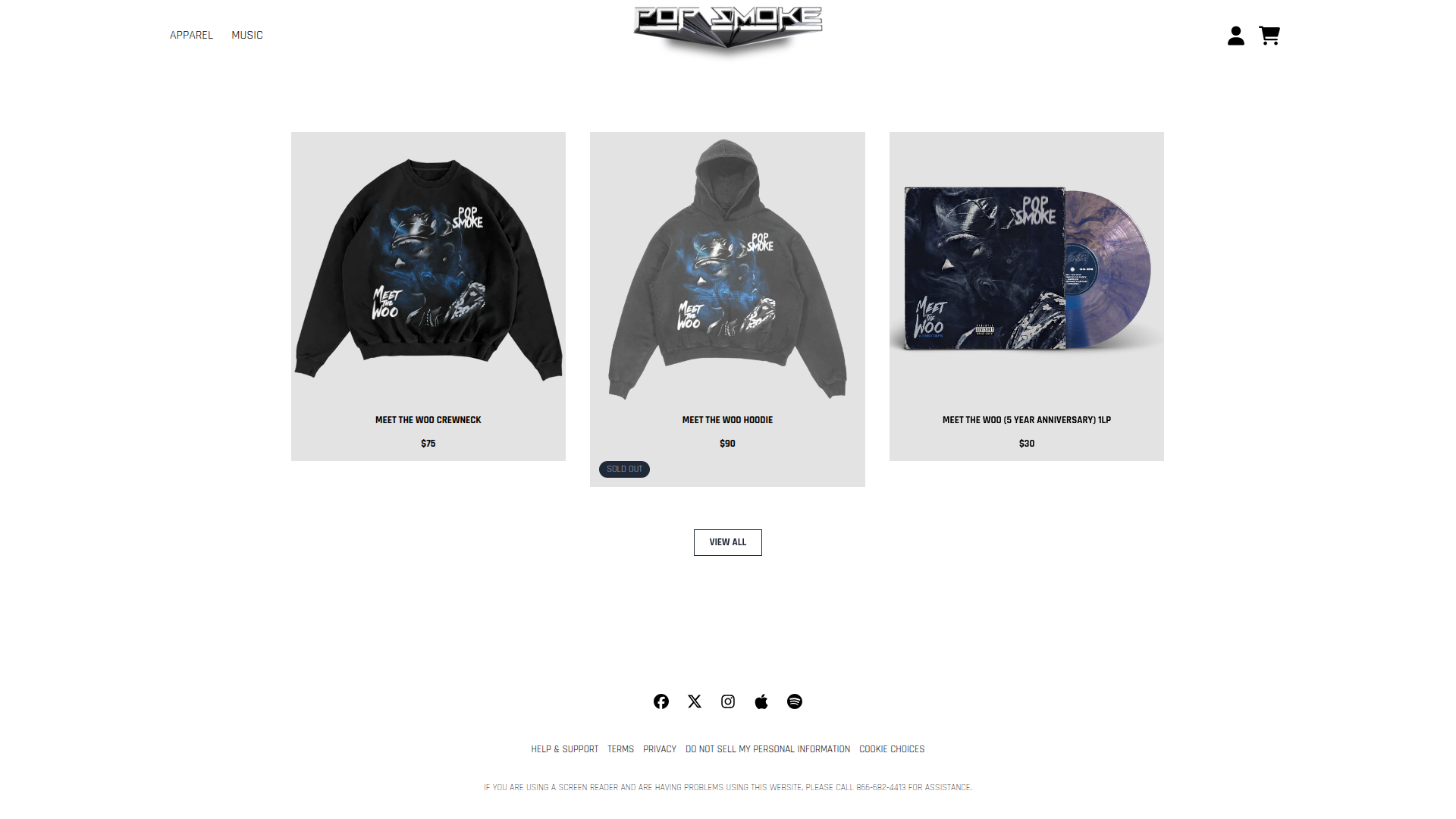
Product Listing Page
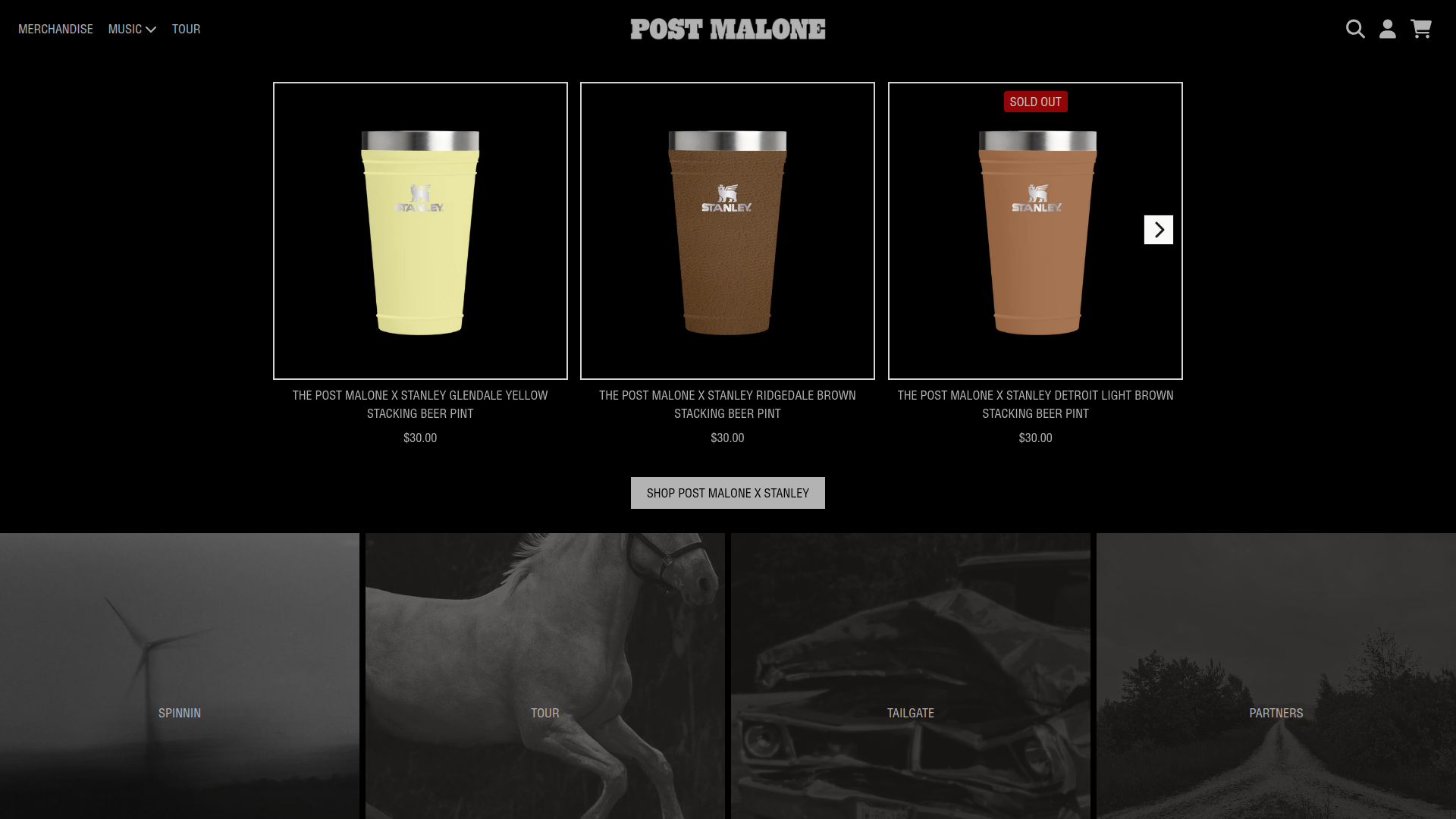
Grid-based storefront pages that display multiple products, ocassionally with filtering and sorting options
Grid layouts, filters, standard e-commerce patterns. These pages showcase the classic e-commerce formula: horizontal navigation, sidebar filters, 3-4 column product grids with large imagery, clear pricing, and persistent cart access.
The consistency across genres proves that fans prioritize familiar shopping experiences over unique layouts.
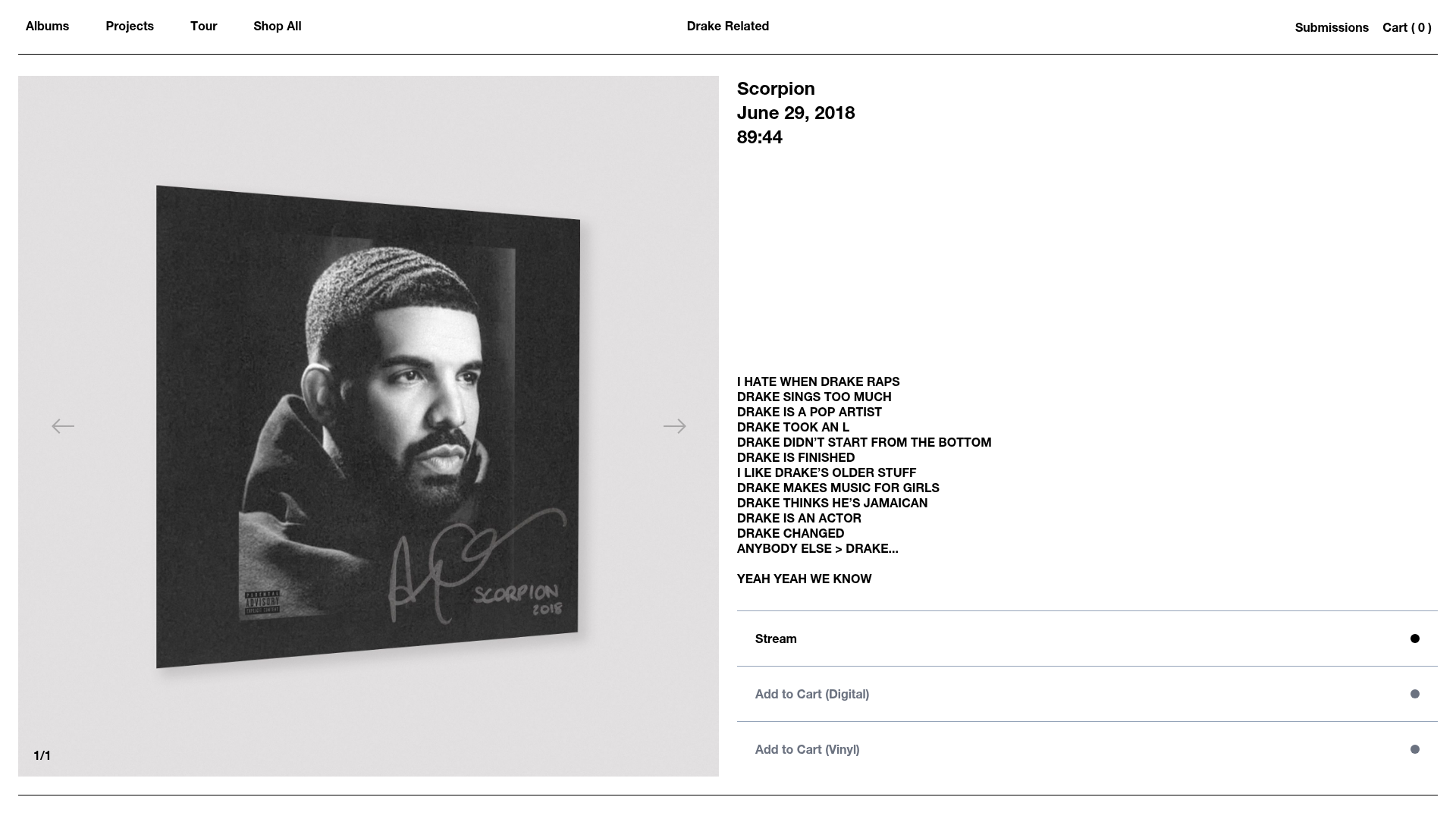
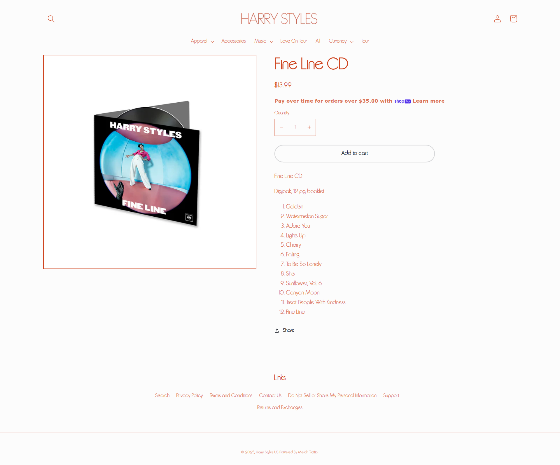
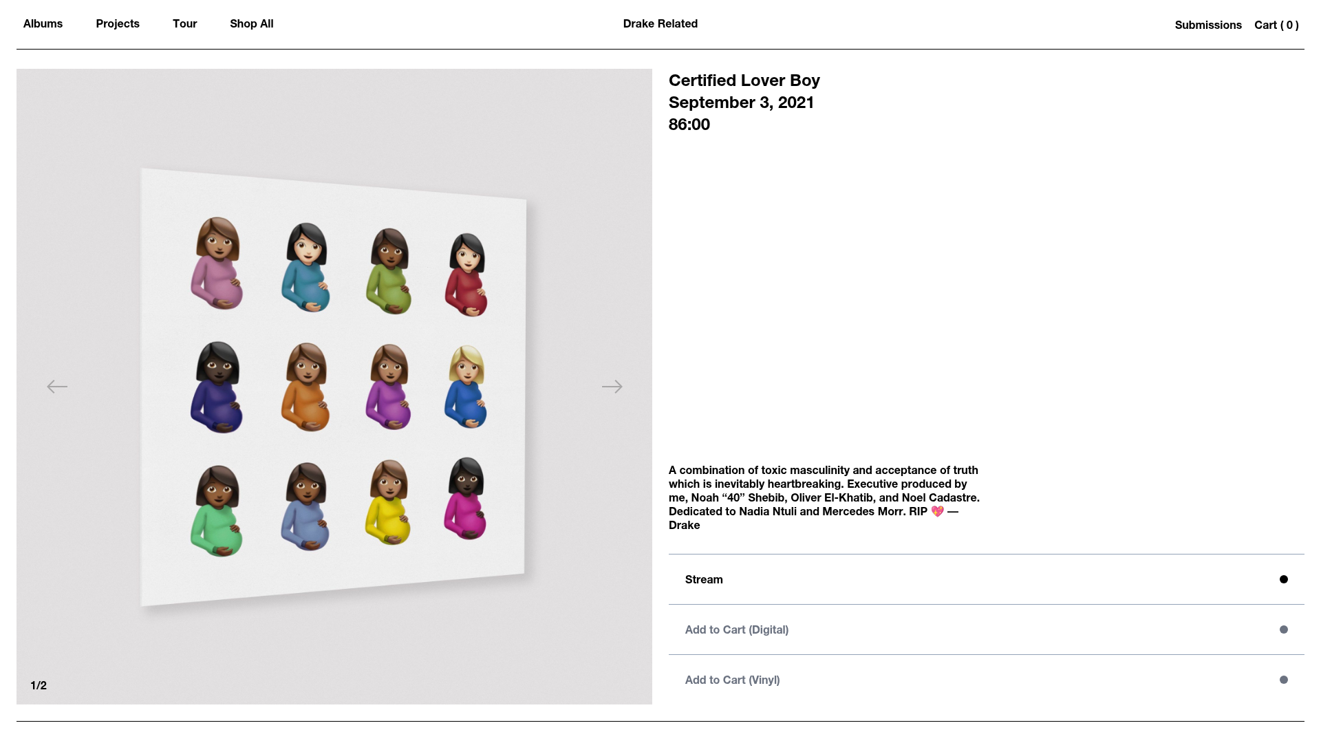
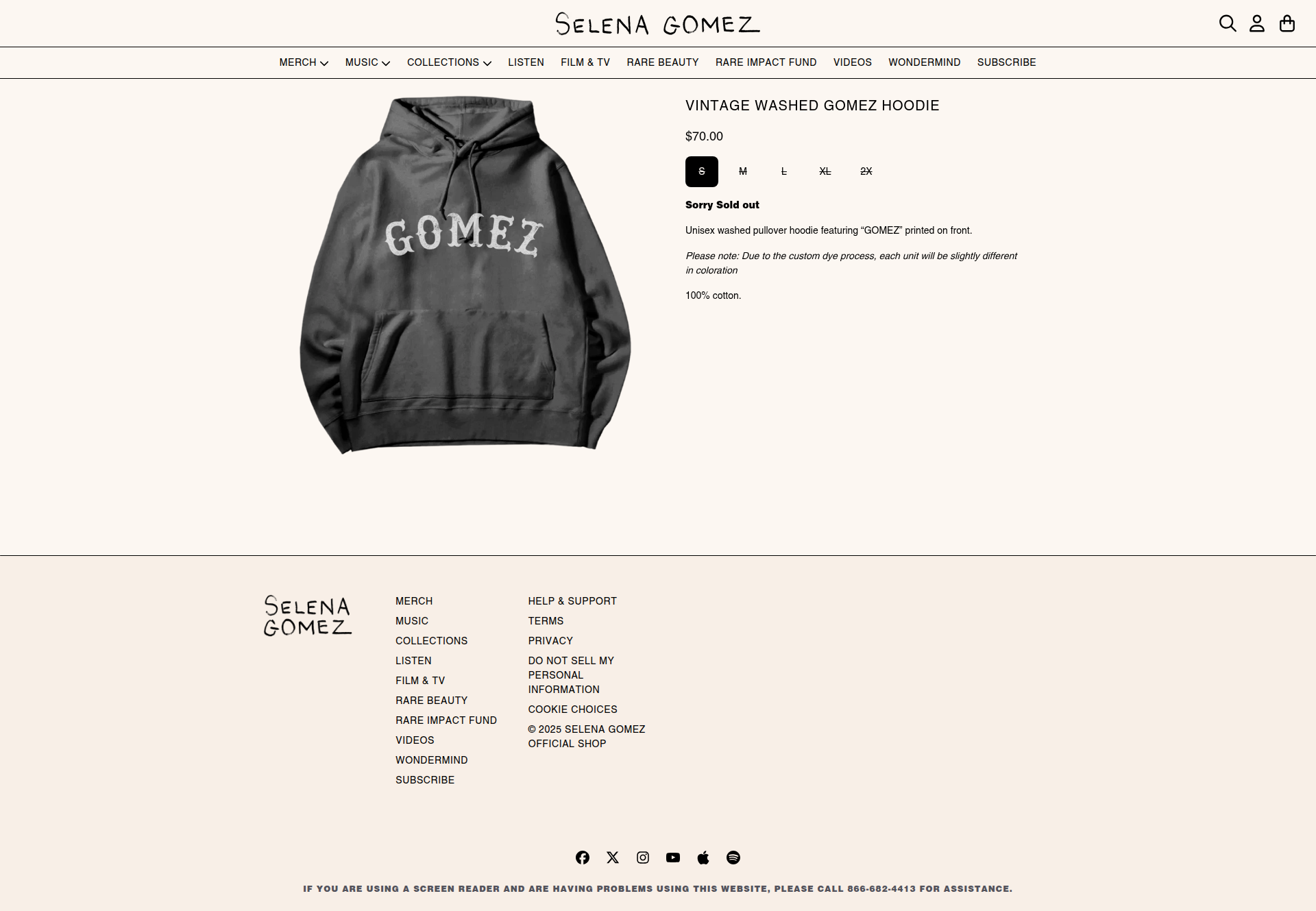
Product Details Page
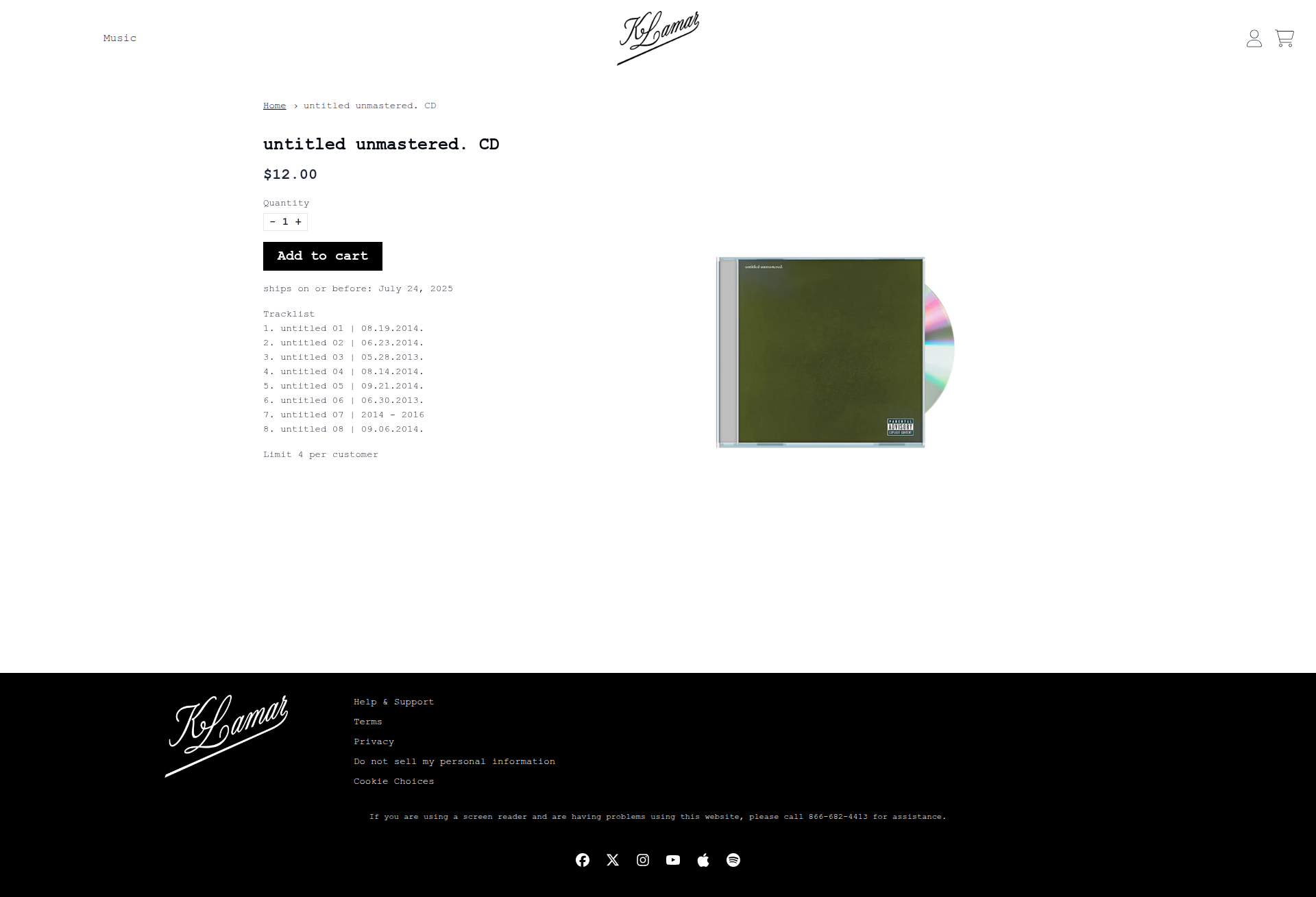
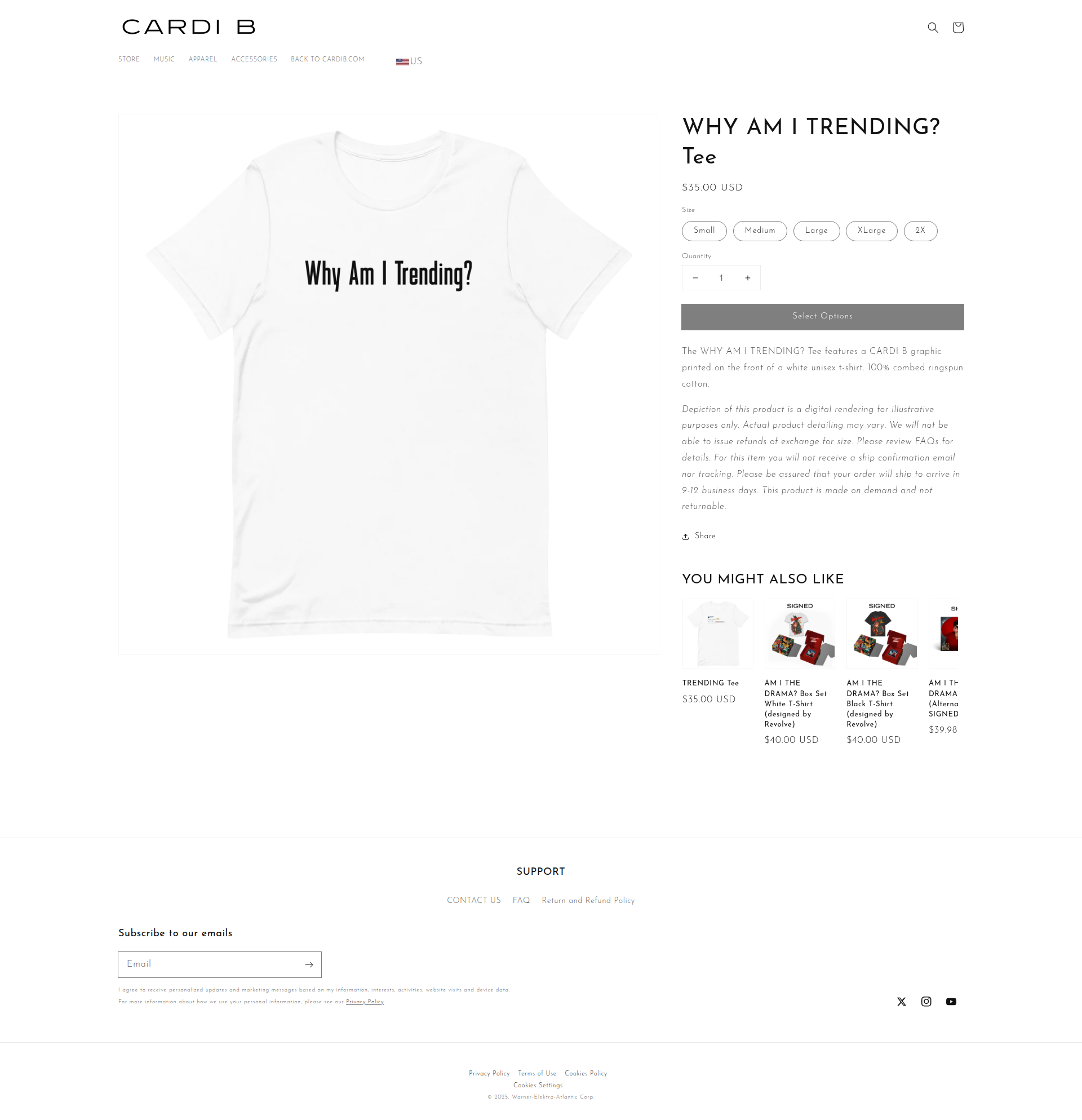
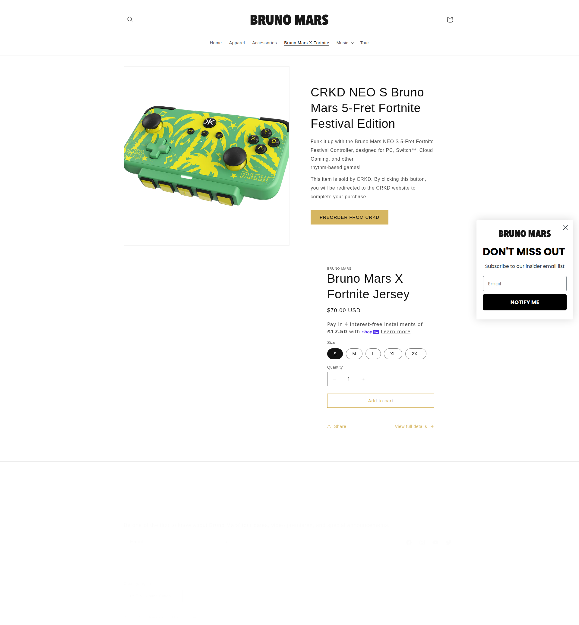
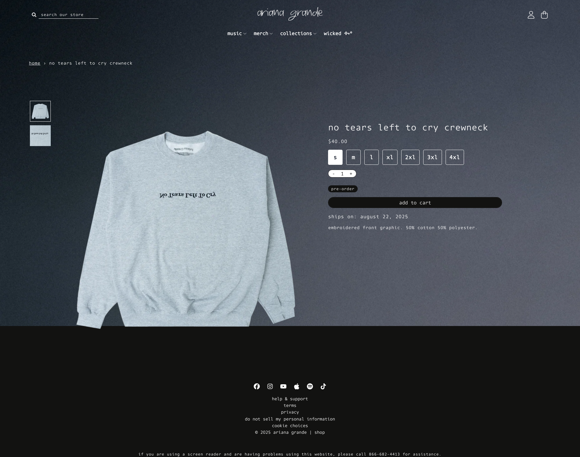
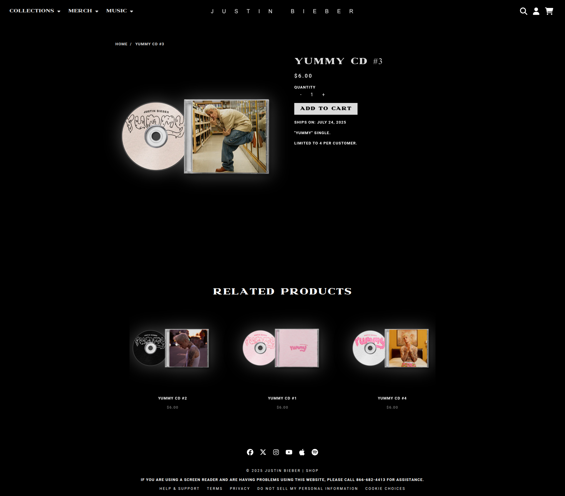
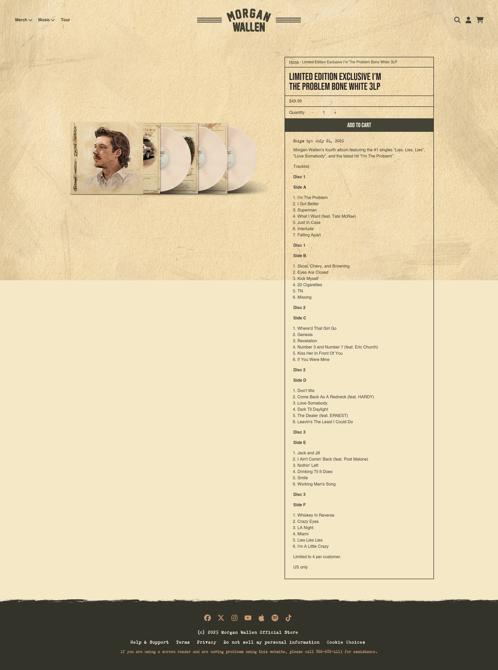
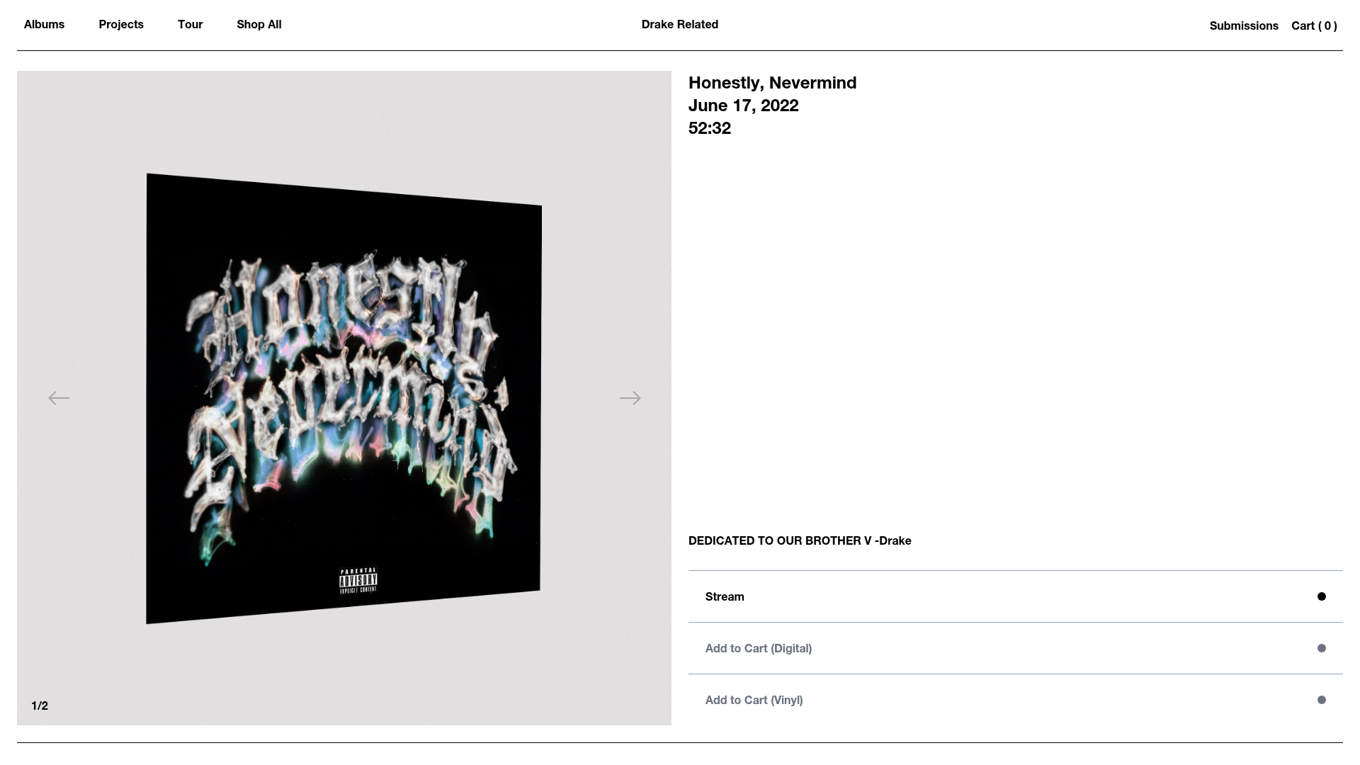
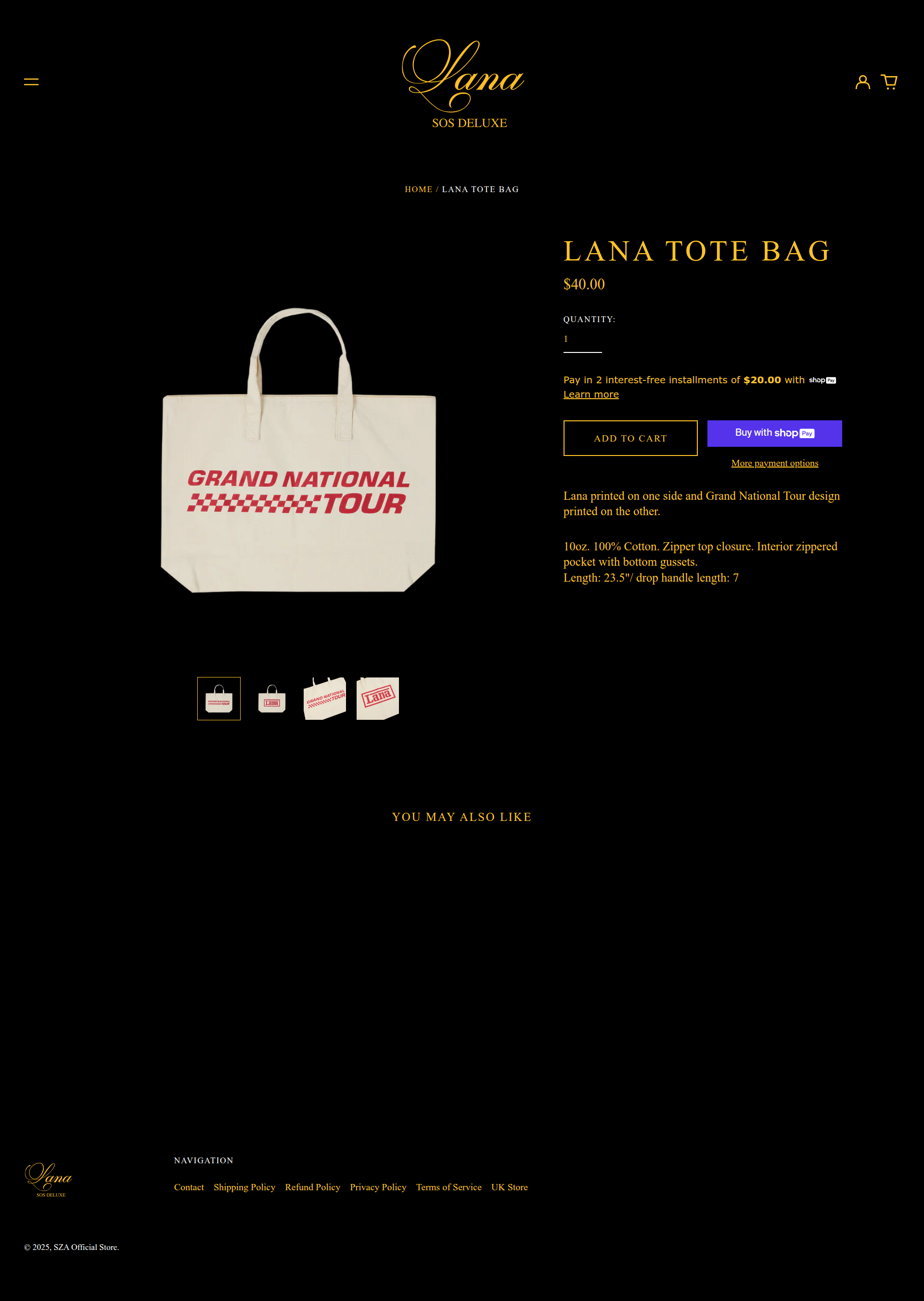
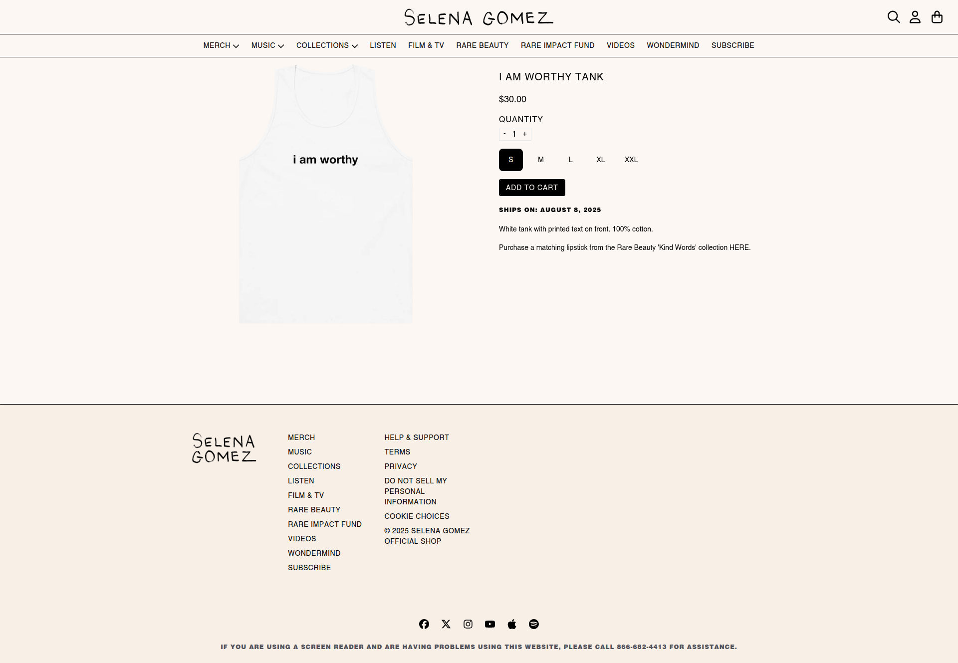
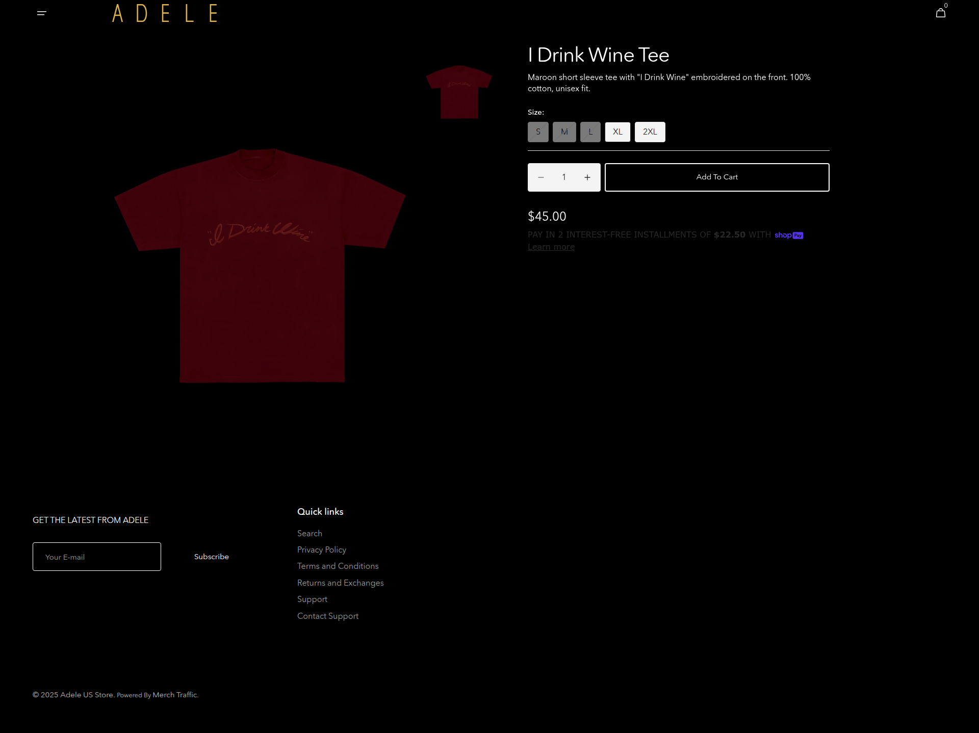
Individual product pages with detailed information, images, sizing, and purchase controls
Individual product pages, sizing, add-to-cart functionality. The anatomy of product detail pages is virtually identical across all artists: large product image on the left, product information and purchase controls on the right, with related products below.
This split-screen layout maximizes visual impact while maintaining familiar e-commerce hierarchy that converts.
Homepage
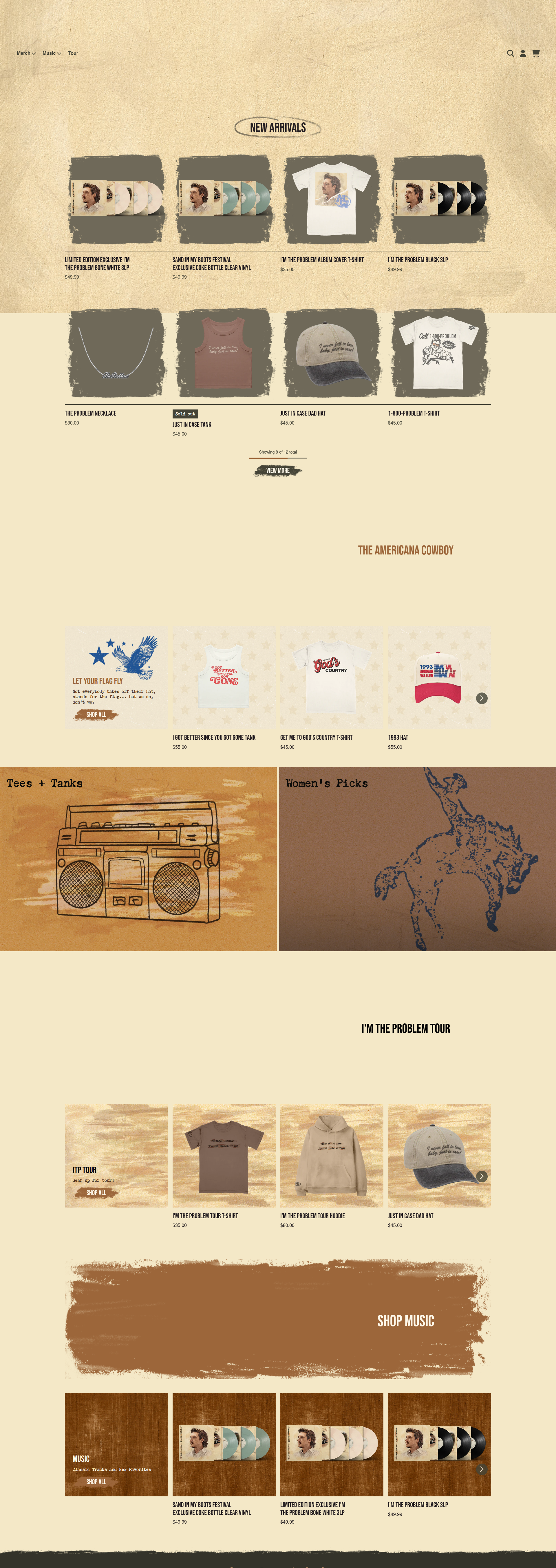
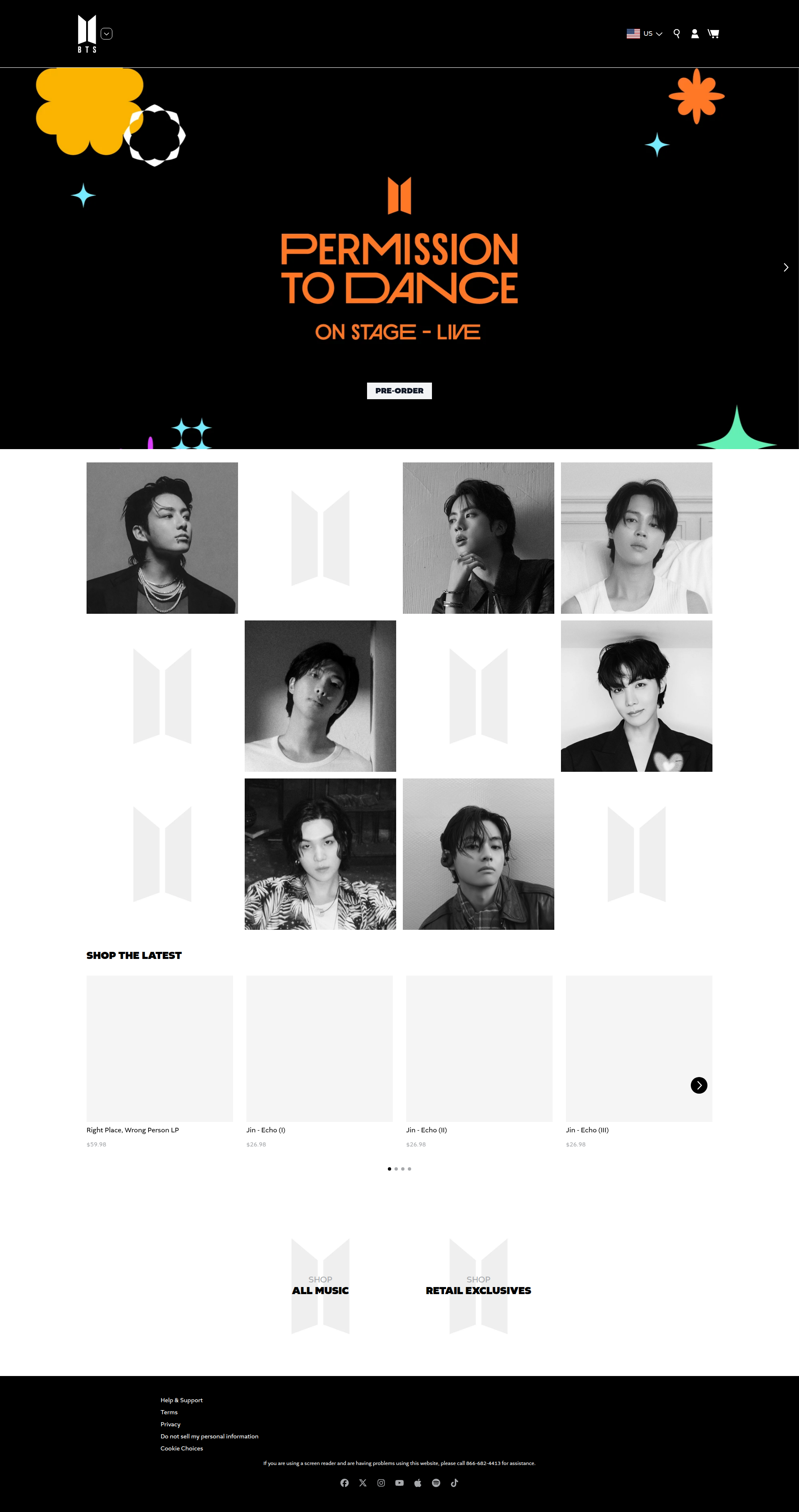
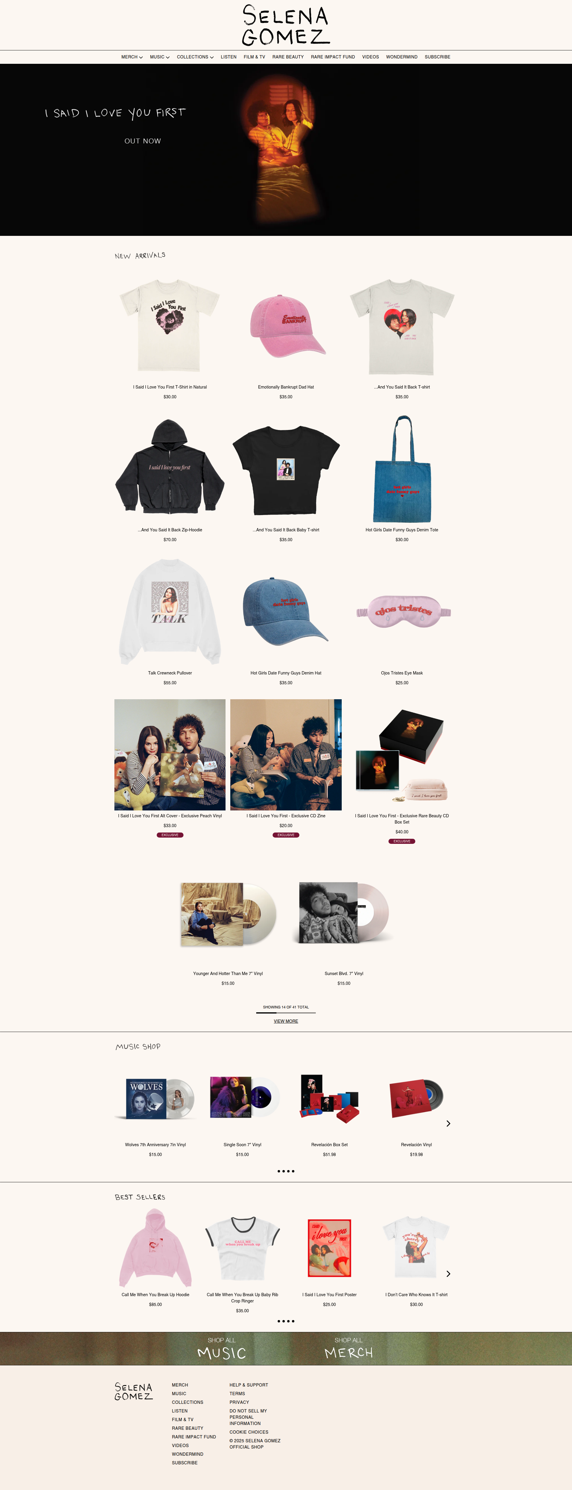
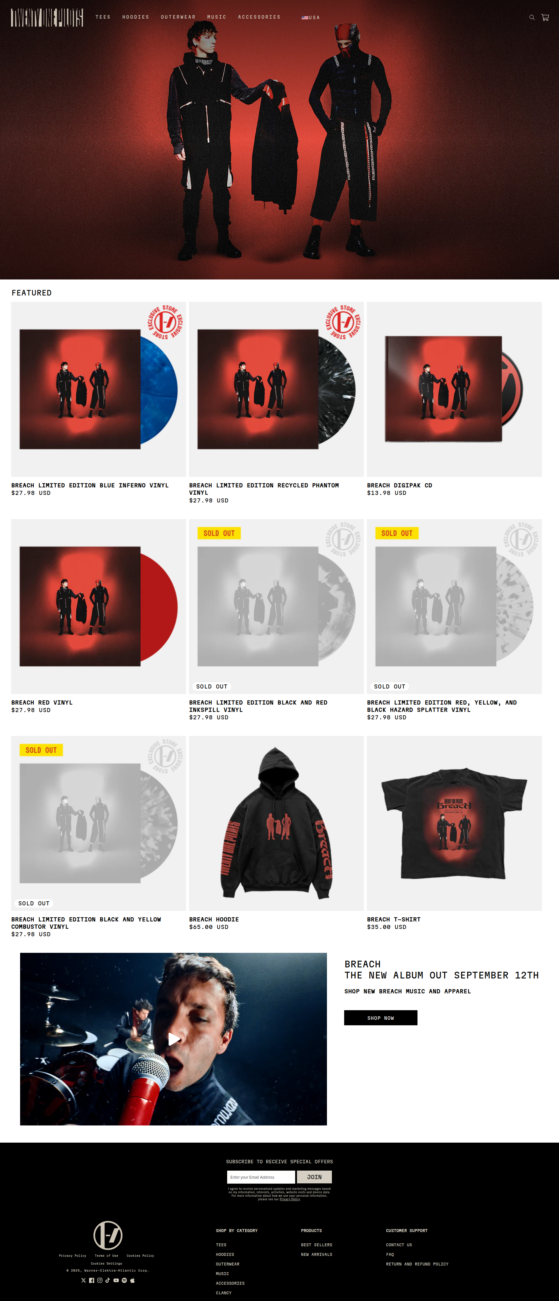
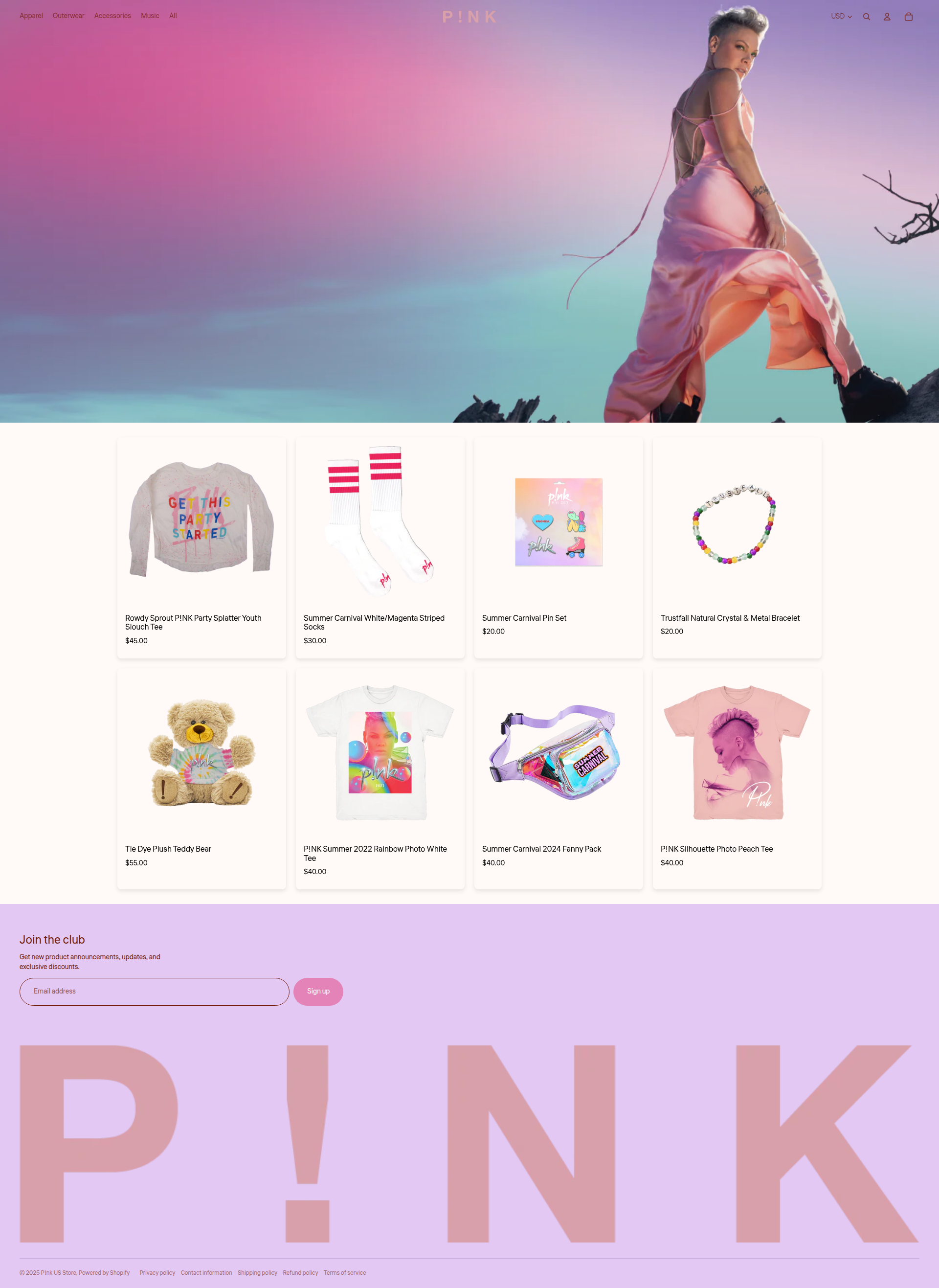
Landing pages with assortments of hero sections, featured products, and brand navigation
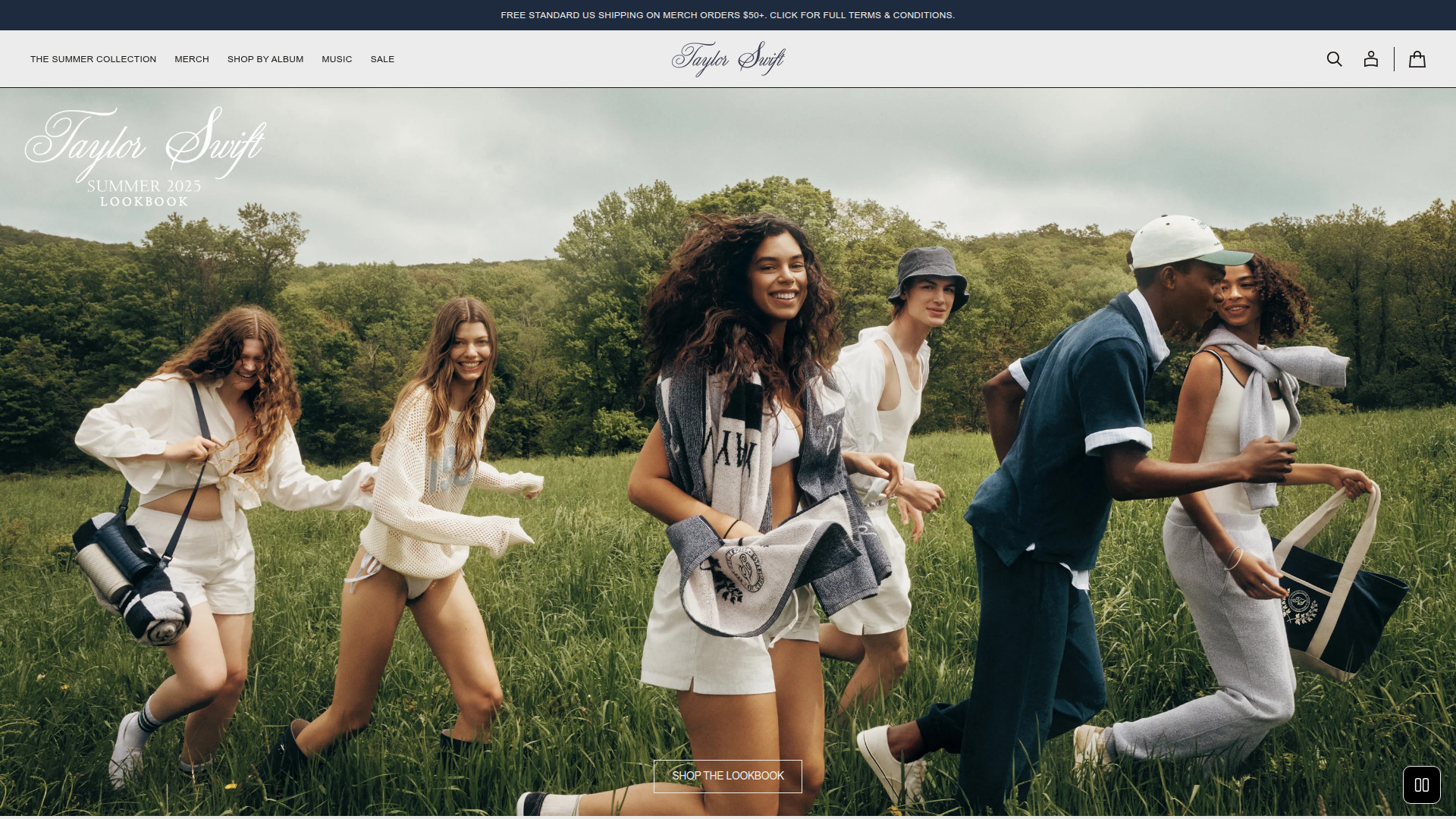
Hero sections, featured content, navigation structures. Artist homepages follow a predictable pattern: brand hero with key messaging, featured product spotlights, category navigation, and footer with social links.
Whether it's Taylor Swift's lifestyle imagery or Drake's minimalist approach, the underlying information architecture remains remarkably consistent.
Tour/Events Page
Concert and event listings with date/venue information and often links to ticket purchasing
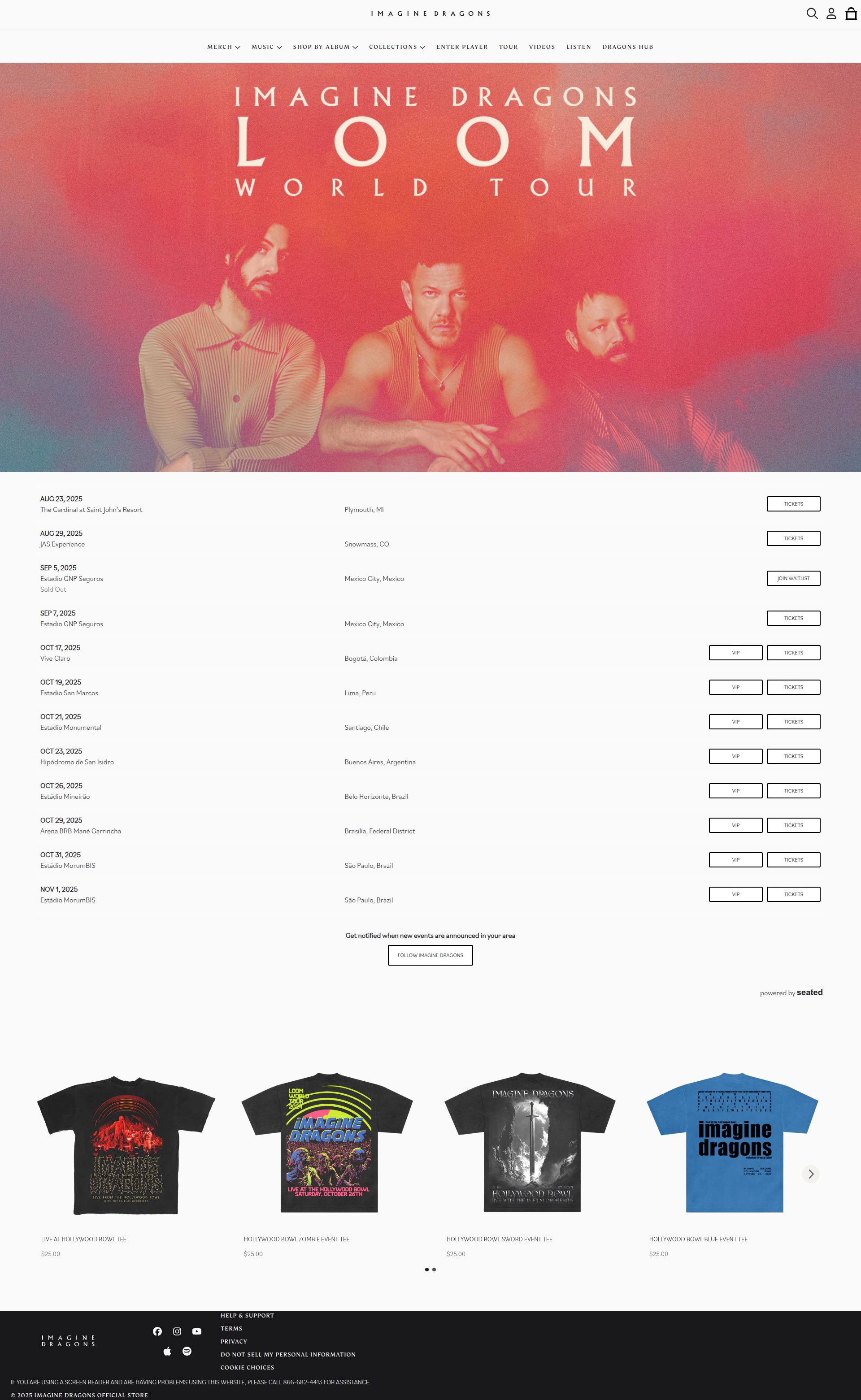
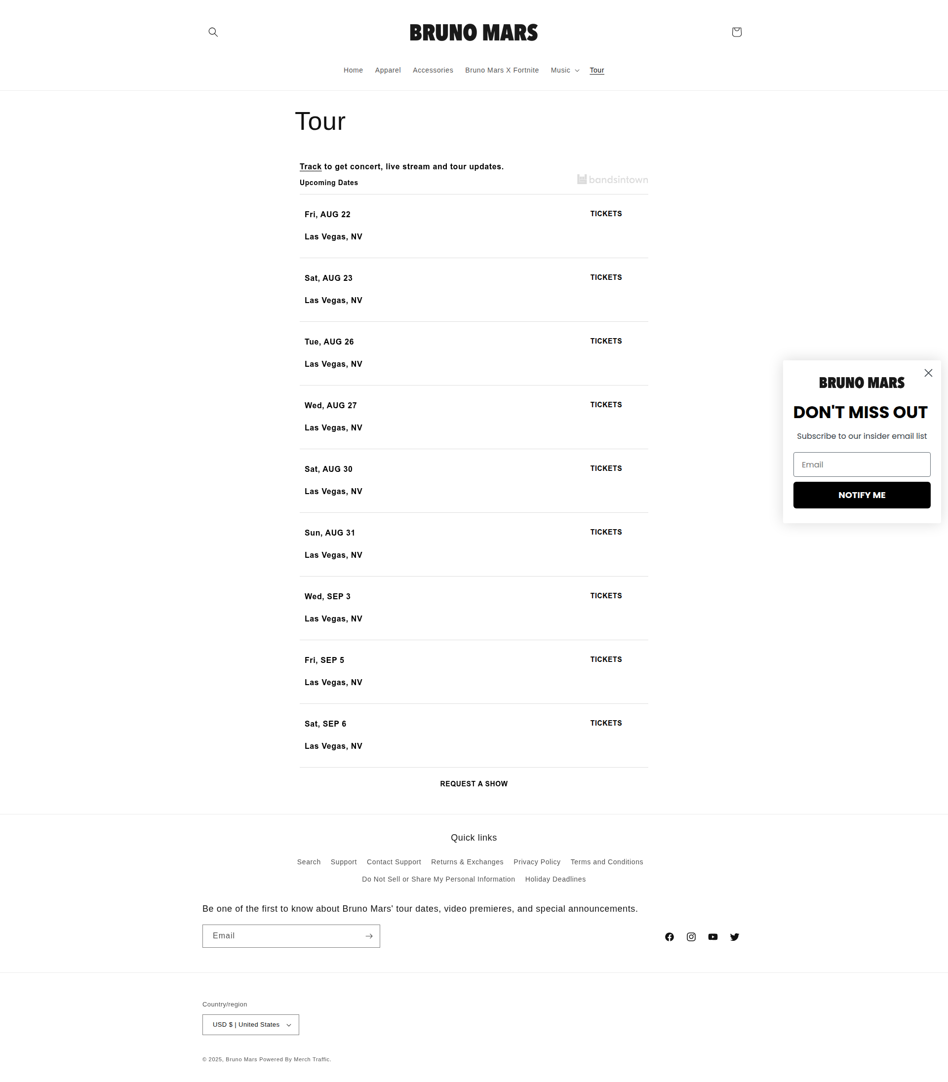
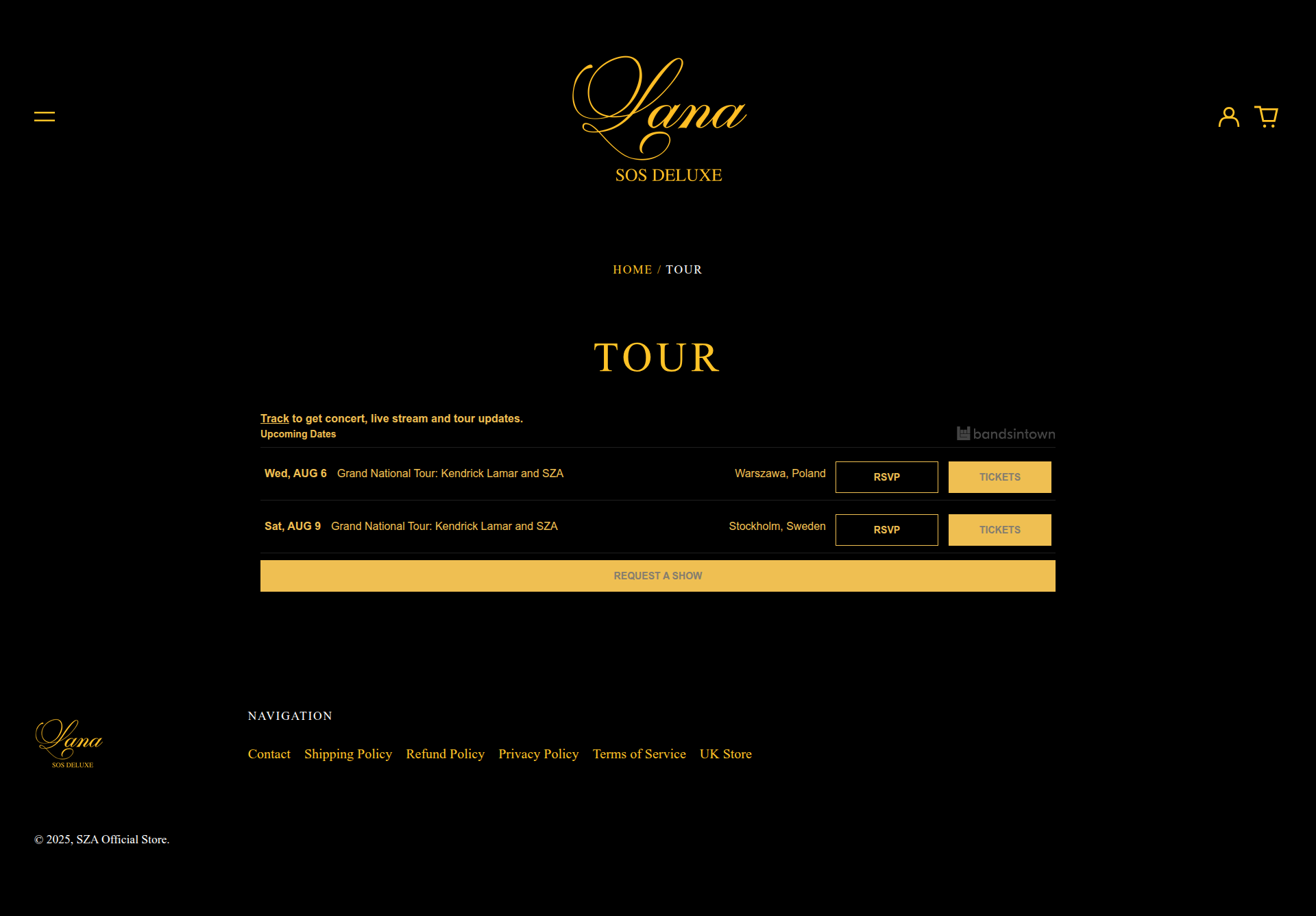
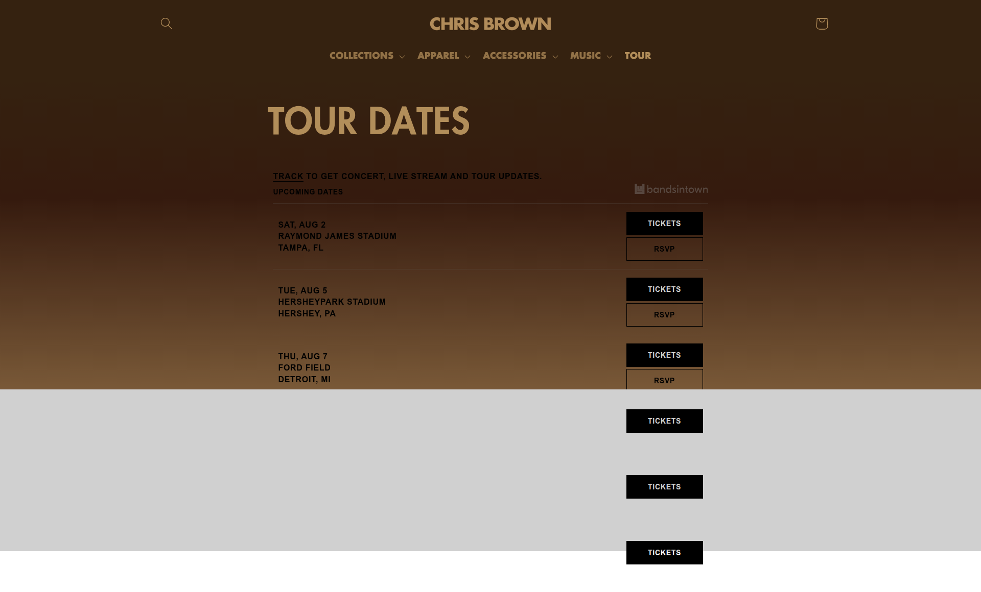
Concert tickets, tour dates, and event information. Despite being music-focused rather than merchandise-focused, tour pages follow remarkably consistent patterns: prominent date/venue listings, clear ticket pricing, and streamlined purchase flows.
The standardization extends beyond merchandise into live experience commerce, with ticket vendors and artists converging on proven conversion patterns.
Artist-specific Pages
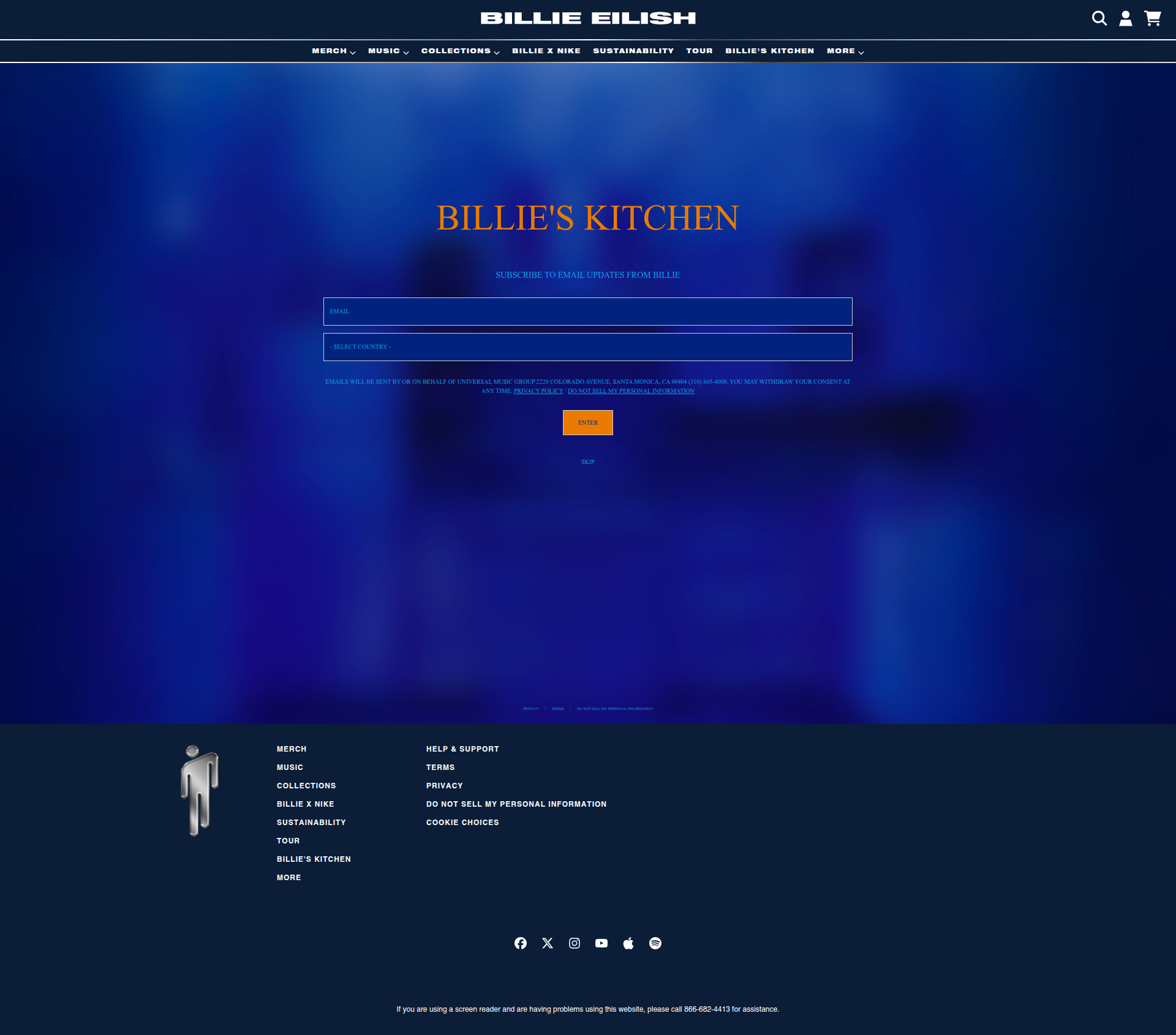
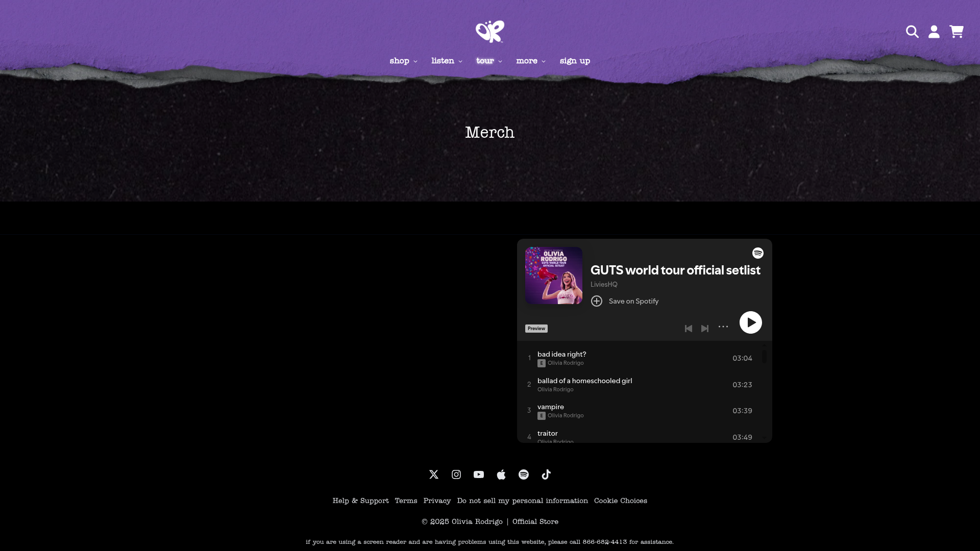
Template outliers that don't fall into common categorizations. Despite their unique presentation, these pages still comprise well-established ecommerce web design features: music players, newsletter signups, product grids, and familiar navigation patterns.
Common Features
Our comprehensive analysis reveals fascinating patterns in how artist stores implement e-commerce functionality. While basic layout elements achieve near-universal adoption, many critical conversion features are surprisingly underutilized.
Technology
We time-boxed this research to 10 days using a sophisticated AI-powered analysis pipeline, including:
Gemini — Accurate URLs via Google Search
🔥Firecrawl — Advanced web scraping and screenshot capture
Claude — Visual analysis and pattern recognition
For the complete technical implementation, methodology, and code examples, see our technical deep dive.
Learnings for Platform Builders
The convergence we discovered aligns with multiple established UX principles:
The bottom line
The data is clear: there is no value in reinventing e-commerce UX for artist stores.
We found major convergence on layout, navigation, and e-commerce patterns across the Billboard Top 100 artist websites.
Avoid reinventing the wheel
The data proves convergence on design patterns. Standardized layouts, intuitive navigation, and familiar checkout processes dominate top-performing artist websites. Deviating from these established norms risks alienating users and reducing engagement.
Familiarity converts
Fans don't want to learn a new e-commerce interface. They want to focus on merch, not figure out a new checkout flow. Familiar design patterns allow fans to shop effortlessly, leveraging their prior experience from other e-commerce platforms to make quick, confident purchases.
Cognitive load kills conversions
Unfamiliar or overly complex interfaces increase cognitive load, leading to user frustration and abandoned carts. Streamlined, predictable interactions reduce decision fatigue and foster trust, directly contributing to higher conversion rates and improved user satisfaction.
Build the patterns that work. Let artists customize colors, fonts, and content. But keep the core interactions familiar.
